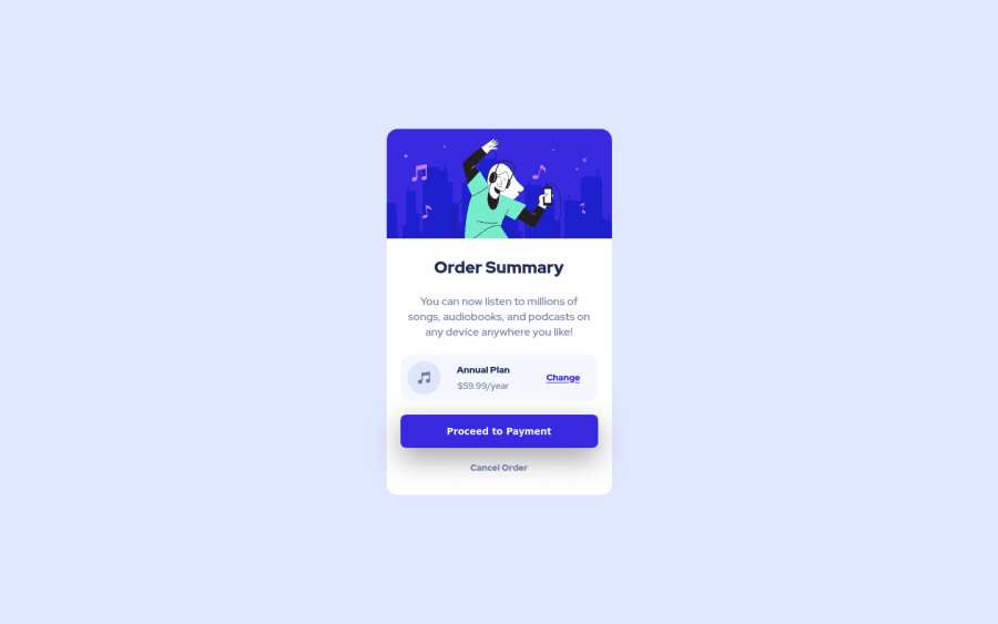
Design comparison
Solution retrospective
Took me ages to get the part in the middle with the music icon and the 'Annual Plan' part. I started by trying to do it as a table. Had some trouble centering things vertically within the div.
I'm not really sure I have the right approach with setting up the fonts and using the weights correctly. Also, what is the best way to get the correct dimensions of things - for instance, is there an easy way to tell how many pixels I should be making the main container.
I noticed that if I zoom in on the live site, the scrolling functions doesn't work properly. It cuts the top off. Would you have advice on that?
Community feedback
- @ArthurPogPosted over 2 years ago
Hey T-Bax, those some good questions that I fought with when doing this challenge as well. I am a beginner, so let's just keep that in mind while we stroll along :D
First of all, the view code button leads to your QR Code solution :) I manually changed the address to order-summary-component-main and got to your solution that way, so no biggie.
Alright, so regarding the centering. The problem is with centering using absolute positioning. Absolute positioning sort of removes your element from its container (not entirely, though, just physically so the container it is in acts as though it's empty and it doesn't react, resize when coming into contact with other containers and it also ignores margins and paddings) and it centers it in the middle. This is OK in some cases, but here you want the container to be aware that there is something inside it so it can resize and change and interact with other elements along with the container. This would be a great usecase for
flex
orgrid
. Basically if you delete yourposition: absolute; left: 50%; top: 50%; transform: translate(-50%, -50%);
from.order_summary
and put this in thebody
-display: flex; justify-content: center; align-items: center; min-height: 100vh; margin: 0;
, everything should act as you need.Justify-content
centers everything horizontally,align-items
does so vertically, BUT it needs a precise height to calculate where the center is, that's why we writemin-height:100vh
because this tells the body to use all of the screen's (viewport's) available height. Themargin:0;
is to get rid of the annoying horizontal scrollbar that sometimes appears. You can also try thegrid
solution:display: grid; place-items: center; min-height: 100vh; margin: 0;
. Arguably easier. The centering is done using one property.Off topic, here's a good rule of thumb when working with images. I recently learned that if it's not important content and just used for illustration purposes, try to load the image as a background-image instead of putting it in the HTML, OR if you load it into the HTML, leave the
alt=""
empty. This is important to assistive technologies like screen readers. Otherwise they will waste time reading that unimportant "Hero Image - Dancing Person" to the user. So you can spend some time learning how to put images in the background, I believe Kevin Powell has a nice video about that.I still don't know what the best practice is regarding fonts. If I should declare it in root or not. And I am not sure about measurements either. For now, I declare it just like you do in
:root
and then userem
as measurement for nearly everything. I found that if the font size is then changed, everything stays relatively nice and unbroken. But I might be wrong. Time will tell.Regarding grouping the music icon, product name and the change link. Sometimes the solution is as simple as grouping things together in
divs
.Example:
- put the music icon into a
div class="icon"
- put the Annual Plan into a
p
- then put the $59.99/year into a separate
p
- this is so these are treated as block elements and they don't go inline, but go below each other - put both paragraphs into a
div class="product-name"
- put both the icon and the product names into a
div class="icon-product-name"
together - put the change into an
a
- put the whole thing into a
div class="whatever"
Then you can tell the icon and product name to behave as inline-blocks, so they stand next to each other. You can give icon a margin-right, if you want.
.icon, .product-name { display: inline-block;}
Then you can give the paragraphs a margin of 0 so they get closer to each other,
-
.product-name p { margin: 0;}
Then you can tell the icon-product-name
div
to flex.-
.icon-product-name {display: flex;}
Then finally you can tell the whole
.whatever
div
to display everything as flex, center it vertically AND most importantly justified it horizontally with aspace-between
value.-`.whatever {display: flex;align-items: center;justify-content: space-between;}
This will do exactly as you please. This can also be done using
grid
.And with regards to your question about finding out the exact sizes if you don't have access to the paid wireframes: There is a really cool open-source free program for Qindows called Greenshot (https://getgreenshot.org/). It basically is like a screenshot on steroids. When you install it don't forget to go to the Keyboard settings in Ease of Access and turn off the "Use the PrtScrn button to open Screen snipping". Then, every time you press your Print Screen button, it will bring up this precise screen snipping tool, which will let you measure EXACTLY how high and wide something is in pixels on your screen.
If you have any other questions, ask!
Happy coding, my guy!
Marked as helpful0@T-BaxPosted over 2 years ago@ArthurPog Thanks for taking the time to go through my solution and pointing out the erroneous URL. I've fixed that up.
I'll go through the solution and try out the things you mentioned, the next time I get a chance. I've no doubt that they will be helpful, and I will learn a lot. I'm really thankful you took the time to give feedback. THANKS!
1@ArthurPogPosted over 2 years ago@T-Bax You are welcome! It helps me understand what I am doing better when explaining it to someone else :) I felt so confused 90% of the time when starting 3 weeks ago, but thankfully, due to me helping others it seems, I've been getting less confused recently. So thank you for posting your solution and being so open about what exactly bugged you.
1 - put the music icon into a
Please log in to post a comment
Log in with GitHubJoin our Discord community
Join thousands of Frontend Mentor community members taking the challenges, sharing resources, helping each other, and chatting about all things front-end!
Join our Discord