Design comparison
SolutionDesign
Community feedback
- @hebrerilloPosted over 2 years ago
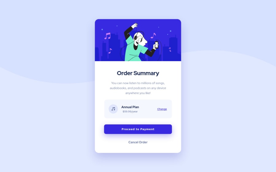
Very good job Tochi! Just one thing: If you display the site on a smartphone and on the landscape, you will realize that the site goes up too much and is not visible. Try adding this media query:
@media screen and (max-height: 560px) { .card { top: 0; transform: translate(-50%, 0%); } }
Because your '.card' component is 567px height, when the view port is close to that height, set the top of the card to the top the view port.
0
Please log in to post a comment
Log in with GitHubJoin our Discord community
Join thousands of Frontend Mentor community members taking the challenges, sharing resources, helping each other, and chatting about all things front-end!
Join our Discord
