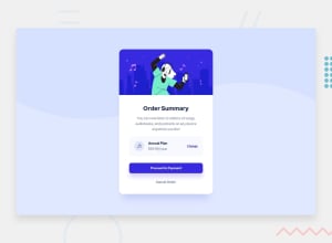
Design comparison
Solution retrospective
I learned from mistakes I have done before. Feedbacks are welcome
Community feedback
- @Mr-jawPosted almost 2 years ago
Hello there! 👋
Great job on completing the challenge
HTML 📄
-
I would suggest using heading in order of priority level, for example (h1 -> h2 -> h3). In this case rather than a
<h2>tag it would be better to use an<h1>tag since it is the most prioritized text in the component and also reduce issues with accessibility. you can use CSS to adjust the font size if you want -
In this sense, the price and the annual plan are data rather than heading. instead of using
<h3>tag you can either use<em>or<strong>tag to emphasize something important or<small>tag to use for small texts. it would also fix some accessibility issues. -
instead of using
<a>tag in<a href="#" class="card-btn">. You can use the<button>tag. Another way to improve accessibility.
CSS 🎨
- Try to use CSS custom properties as much as you can. it will make web development a lot easier. let's say that the design team has changed the color theme, and you would have to find each and every element with that color to change it. But, by using CSS custom properties you can change in the
:root, and wherever you used those colors will be automatically updated. more about CSS custom properties
I hope this was helpful 😊
HAPPY CODING
Marked as helpful0 -
Please log in to post a comment
Log in with GitHubJoin our Discord community
Join thousands of Frontend Mentor community members taking the challenges, sharing resources, helping each other, and chatting about all things front-end!
Join our Discord
