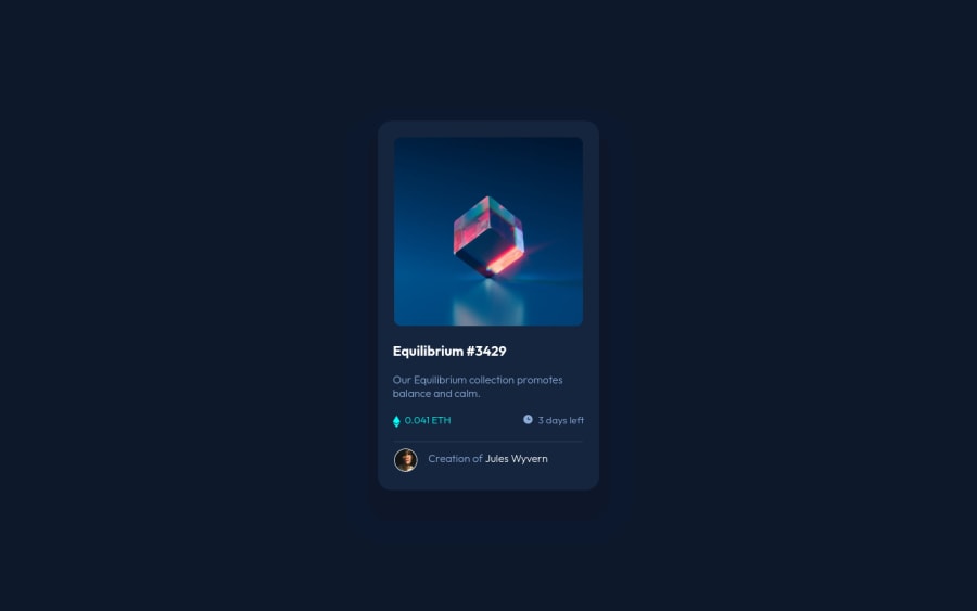
Frontend Mentor - NFT preview card component solution using flexbox
Design comparison
Solution retrospective
For the hovering effect on the image to show the view-icon and changing color of the image, is there any better solution to improve that feature? I think my solution on that feature is not the best practice because I use the opacity to make the view-icon invisible.
Community feedback
- @vanzasetiaPosted almost 3 years ago
👋 Hi Hồ Lê Minh Thạch!
🎉 Congratulations on finishing this challenge! In my opinion, the best solution to make the hover effect is to use
background
properties and pseudo-elements. You can see my solution and take a look at theREADME
if you want to know how to do that.I have some feedback on this solution:
- Accessibility
- All the page content should live inside landmark elements (
header
,nav
,main
, andfooter
). By using them correctly, you can make users of assistive technology navigate the website easily. In this case, you can wrap all of it withmain
tag.
- All the page content should live inside landmark elements (
<body> <main> page content goes here... </main> </body>
- The alternative text for any images should not contain any words that are related to image, like picture, photo, avatar, etc. The screen reader will pronounce them as images as long as you are using
img
tags. - You can use the creator name as alternative text for the avatar.
- The Ethereum and clock icons are decorative. So, for any decorative images, each
img
tag should have emptyalt=""
andaria-hidden="true"
attributes to make all web assistive technologies such as screen reader ignore those icons. - Some resources to learn about the alternative text and images.
- For decorative SVGs or images, add
aria-hidden="true"
attribute to thesvg
. - Use interactive elements (
a
) for any elements that have:hover
or:active
states. - Create a custom
:focus-visible
styling to any interactive elements (button
, links,input
,textarea
). This will make the users can navigate this website using keyboard (by usingTab
key) easily. - Changing the
html
or root font size can cause huge accessibility implications for those of the users with different font sizes or zoom requirements. Read what an accessibility expert (Grace Snow) has said about it. - Styling
- I would recommend letting the element inside the card decide the height of it.
- Right now, the card gets cut off on mobile landscape view (640px * 360px).
- Best Practice (Recommended)
- I would recommend using the
.gitignore
that has been provided by Frontend Mentor. That way you can prevent your GitHub repo having.DS_Store
file(s). Also, make sure to upload it to the GitHub repo, so that if someone else (might be you in the future) wants to improve the solution, he/she/you don't need to set the.gitignore
file. - Put all the CSS in a separate CSS file. Don't mix the HTML and CSS 🙂.
- Prefer unitless for
0
value.
- I would recommend using the
* { padding: 0; margin: 0; box-sizing: border-box; }
That's it! Hopefully, this is helpful!
Marked as helpful2@MichaelHo02Posted almost 3 years ago@vanzasetia Thank you a lot for your time. I have more understanding of my solution now.
0 - Accessibility
- @SheGeeksPosted almost 3 years ago
I'm not sure about best practices with opacity, but I used that property as well to get the effect . Alternatively, you could try using visibility instead.
Marked as helpful1
Please log in to post a comment
Log in with GitHubJoin our Discord community
Join thousands of Frontend Mentor community members taking the challenges, sharing resources, helping each other, and chatting about all things front-end!
Join our Discord