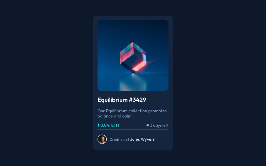
Frontend Mentor - NFT preview card component solution
Design comparison
Solution retrospective
Hey, I am a beginner at this field. So, can you provide some areas that i should focus on. Also, can you rate my code.
Community feedback
- @vanzasetiaPosted almost 3 years ago
👋 Hi Prajwol Shrestha!
🎉 Congratulations on finishing this challenge! Here is some feedback from me:
- Accessibility
- Any elements that have
:hover
or:active
state should be interactive elements, which in this case they should be links. - Don't limit the
height
of thebody
element. Usemin-height
instead. - Create a custom
:focus-visible
styling to any interactive elements (button
, links,input
,textarea
). This will make the users can navigate this website using keyboard (Tab
) easily. - Fix all the issues that have been generated by the Frontend Mentor.
- For any decorative images, each
img
tag should have emptyalt=""
andaria-hidden="true"
attributes to make all web assistive technologies such as screen reader ignore those images. In this case, since you are using inline SVG, you can addaria-hidden="true"
to thesvg
tag. - Use
rem
or sometimesem
unit instead ofpx
. Usingpx
will not allow the users to control the size of the page based on their needs. - I would recommend using
border
instead ofhr
element.hr
element has meaning, which is a separator. In this case, the content below thehr
element is also the part of the card content. - There's no need
title
attribute on a link. If you want to provide a text, consider usingimg
and provide thealt="view equilibrium"
. You can see my solution on how it works.
- Any elements that have
- CSS
- Not all elements inherit the styling from the
body
element. You can set thebox-sizing: border-box;
on thehtml
element instead which is the absolute root element of the document. - There's no need to set the
width
of the card for every breakpoint. I would recommend usingmax-width
to limit the card width. Also, there's no need to usecalc()
. - To prevent the card from having full width on mobile devices, you can add some
padding
on thebody
.
- Not all elements inherit the styling from the
I have one suggestion for you, you can remove the
xmlns
attribute from thesvg
tag and thesvg
will just work fine. You can visit this GitHub repo that tells you more about how to write maintainable HTML.That's it! Hopefully, this is helpful!
Marked as helpful2@Prajwol-ShresthaPosted almost 3 years ago@vanzasetia Thanks man, really appreciate it.
1 - Accessibility
- @Anubliss-0Posted almost 3 years ago
Hey Prajwol, congratulations on completing the challenge!
Vanza Setia has already given some incredible feedback on your project! There's really not a lot I can add but I can give you some useful links.
Wave web accessibility evaluation tool - https://wave.webaim.org/
W3 markup checker - https://validator.w3.org/
It's easy to make errors as a developer, so I use these to spot any issue I may have missed.
Again, great job on the challenge and good luck!
Marked as helpful1 - @PhoenixDev22Posted almost 3 years ago
This comment was deleted almost 3 years ago
1@vanzasetiaPosted almost 3 years ago@PhoenixDev22 In my opinion, using inline svg is okay on this project, as long as you can provide a way to make it accessible.
2@vanzasetiaPosted almost 3 years ago@PhoenixDev22 Whether you are using
img
orsvg
, I think none of them is better than the other.Usually, I use inline
svg
if I need to change the color of the icon, like social media icons when they get hovered. It's much easier to usefill
property rather thanfilter
property (if you are usingimg
tag).If the image is an informative or meaningful image, then I usually use
img
tag so that I can provide alternative text easily (usingalt
attribute).0@PhoenixDev22Posted almost 3 years ago@vanzasetia
I know the advantages of SVG’s and what they are , their usage and their attributes and how big the SVG’s world . What I think , you can render the contents of an SVG file as an image within an HTML document using an <img> tag better as they add some bulk into your code (for this challenge ). When you intend to change what it looks like you can embed SVG’s , you can control them directly (not when the image links to an external file) . So if you have a very long and complicated SVG’s , it can take up lots of line and crowd up your markup. These are not informative .They decorative images so you can set the alt attribute to an empty string. I hope you get right now .
0@vanzasetiaPosted almost 3 years ago@PhoenixDev22 Yes, I get it. What I'm trying to say since my first reply is that your suggestion is not wrong at all. Sorry, if you feel offended 😞.
What I'm trying to say is that using inline svg or
img
is okay.But, I agree that inline svg can make the HTML code looks crowded 😅.
Hopefully this clear the misconception.
1@PhoenixDev22Posted almost 3 years ago@vanzasetia Not at all .Sorry for any misunderstanding. I really appreciate any helpful feedback. Thanks a lot .
1
Please log in to post a comment
Log in with GitHubJoin our Discord community
Join thousands of Frontend Mentor community members taking the challenges, sharing resources, helping each other, and chatting about all things front-end!
Join our Discord