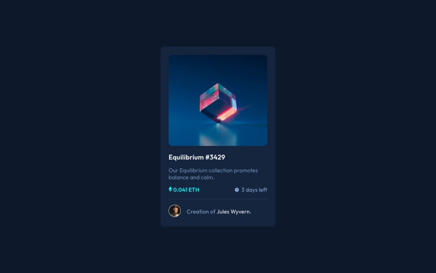
Design comparison
Solution retrospective
I don't have any questions.Just took this project to get started with sass.
Community feedback
- @PhoenixDev22Posted over 2 years ago
Hello Mehemmed77,
Excellent work! Congratulation on completing this challenge. I have some suggestions regarding your solution, if you don’t mind:
HTML
- Page should contain a level-one heading. In this challenge , as it’s not a whole page, you can have
<h1>visually hidden withsr-only. And then you ca use<h2>for theEquilibrium #3429.
- You can use
<main>landmark to wrap the NFT card and<footer>for the attribution. HTML5 landmark elements are used to improve navigation experience on your site for users of assistive technology.,
- Since there's a :hover state on the image and means it's interactive, So there should be an interactive element around it. When you create a component that could be interacted with a user , always remember to include interactive elements like(button, textarea,input, ..)
for this imagine what would happen when you click on the image, there are two possible ways:
1: If clicking the image would show a popup where the user can see the full NFT, here you use<button>. 2:If clicking the image would navigate the user to another page to see the NFT, here you can use<a>. For the same reason , you can use<a>to wrapEquilibrium #3429andJules Wyvern.
- The link wrapping the equilibrium image should either have
Sr-onlytext, anaria-labeloralttext that says where that link takes you.
- For any decorative images, you should add aria-hidden=”true” to the svgs(
icon-view, icon-ethereum, icon-clock)as they are decorative, We use focusable ="false" to avoid any focus on SVG by IE (> 10 and Edge)
<svg aria-hidden="true" focusable="false"> ... </svg>- The icon view doesn’t really need to be in the HTML. You can use CSS for it.
- If you wish to draw a horizontal line, you should do so using appropriate CSS. You may remove the
<hr>, you can useborder-top:to the avatar's part.
- To use more semantic tags , you may use
<figure>and<figcaption>for the avatar's part.
- The alternate text on the avatar image should not beavatar, it’s meaningless. You can use the creator's name
Jules Wyvernfor the avatar image. Read more how to write an alt text
- Never use
<span>alone to wrap a meaningful content. Just keep in mind that you should usually use semantic HTML in place of the span tag unless none of them (the semantic tags) really match the content.* By adding semantic tags to your document, you provide additional information about the document, which aids in communication. like in here<span class="days">3 days left</span>
- For
class="icon-time-container", you can use an unordered list<ul>, in each<li>there should be<img>and<p>that way you can align them centrally.
There are so many ways to do the hover effect on the image, The one I would use is pseudo elements
::before, ::after. You can use pseudo-elements to change the teal background color to hsla. Then the opacity can be changed from 0 to 1 on the pseudo element on the hover. Also using pseudo elements makes your HTML more cleaner as there's need for extra clutter in the HTML .Overall, well done! Hopefully this feedback helps.
Marked as helpful0@Mehemmed77Posted over 2 years ago@PhoenixDev22 Thank you for your feedback.I really appreciate it.
1@PhoenixDev22Posted over 2 years ago@Mehemmed77 You're welcome and glad it was helpful.
0 - Page should contain a level-one heading. In this challenge , as it’s not a whole page, you can have
Please log in to post a comment
Log in with GitHubJoin our Discord community
Join thousands of Frontend Mentor community members taking the challenges, sharing resources, helping each other, and chatting about all things front-end!
Join our Discord
