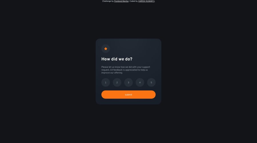
Frontend Mentor | Interactive rating component
Design comparison
Solution retrospective
please give feedback,alternative methord make it good and sport the error
Community feedback
- @AGutierrezRPosted 11 months ago
Hello there @harishfuego33 👋. Good job on completing the challenge!
I have some suggestions about your code that might interest you.
General Structure and HTML:
- Wrap the primary content within the
<main>tag instead of using it as a standalone component like a<div>. - All the content should be contained within landmarks. Every page minimally needs a
<main>element. - Use a
<form>and<input type="radio">instead of using<div>.
CSS and Styling:
-
To center the card use the following styles
body {
  display: flex;
  flex-direction: column;
  justify-content: center;
  align-items: center;
  min-height: 100vh;
}
and remove following rules from
.section1:position: absolute; */ top: 50%; left: 50%; transform: translate(-50%,-50%); min-height: 351px; -
Instead of fixed widths, employ
max-widthandmin-widthfor flexible and responsive design. -
Let the content decide the height of the elements. Use padding and margins strategically for this purpose.
-
The
bodyshould not have itsheightlimited. Instead of usingheight: 100vh, usemin-height: 100vh.
Accessibility and Semantic HTML:
- The illustration images are decorative, so their alt text must be empty:
alt="". - Use a
<form>and<input type="radio">instead of using<div>, this is better for screen reader users.
I hope you find this helpful 😁. Most importantly, your submitted solution is fantastic!
Happy coding!
Marked as helpful0 - Wrap the primary content within the
Please log in to post a comment
Log in with GitHubJoin our Discord community
Join thousands of Frontend Mentor community members taking the challenges, sharing resources, helping each other, and chatting about all things front-end!
Join our Discord
