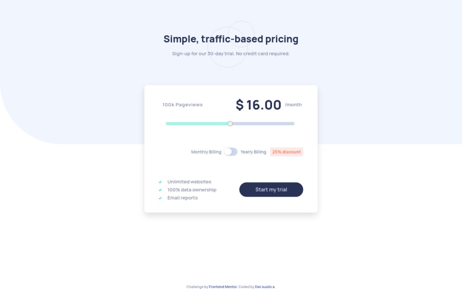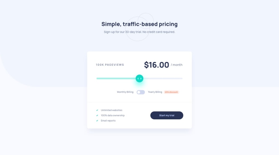
Design comparison
SolutionDesign
Solution retrospective
thanks for any feedback
Please log in to post a comment
Log in with GitHubCommunity feedback
- @pikapikamart
Hey, great work on this one. Layout in desktop is really good also almost like the design! Mobile state is fine, however, from mobile transitioning to tablet or to desktop size, the layout starts being hidden.
Suggestions would be that:
- adding a
padding-bottomto thebodytag so that there will be space from the layout to the side of the screen. You can see it is touching the bottom if you scale the width of your browser. - your slider and the checkbox should have their own visual indicator, adding an
outlineon theirfocus-visiblestate so that keyboard users will know where they are when navigating. - the checkbox could have used
label. Example, clicking the monthly billing or yearly billing triggers the checkbox. That would be great, but if you were not to add it, make sure to addaria-labelon the checkbox. - also, it could be great if the whole box is wrapped inside a
formelement. This will make the targeting of everyinputelement easier if this were created as a usable app. - the attribution also is overlapping the content, the
position: absolutecauses this, but when I remove it, it is hidden now. Haven't solved that one out yet, but maybe you can tinker with it :> - the
colorof the "start my trial" text on mobile state changes and goes darker which is hard to read. Changing it to white would be really great.
Still, great job on this.
Marked as helpful - adding a
Join our Discord community
Join thousands of Frontend Mentor community members taking the challenges, sharing resources, helping each other, and chatting about all things front-end!
Join our Discord
