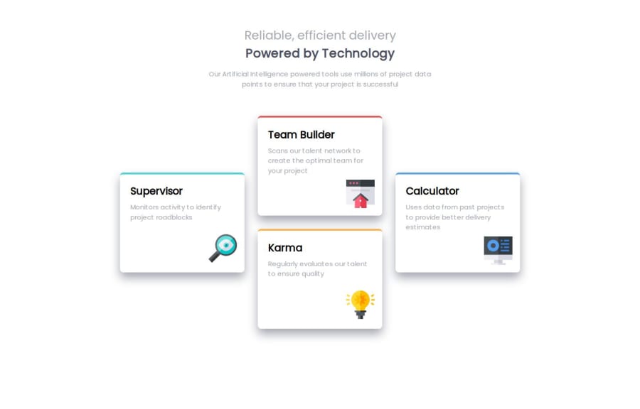
Design comparison
Solution retrospective
I'm getting more comfortable to figure out the layout styles and which rules of CSS needed to be acheived the result.
What challenges did you encounter, and how did you overcome them?I have confused to which layout styles i need to use at first (grid or flexbox). and get some more time to adjusting to it.
What specific areas of your project would you like help with?-When i used media-queries, the icons of two cards were out of place. I don't know why it occurred. So i have to adjust their top on the media queries like this
.service-team-builder .img--service-icon , .service-calculator .img--service-icon { top: 5%; }
-I need a bit help of naming convention on CSS selector which i tried to follow BEM (Block, Element, Modifier). I think what i used so far was not corrected.
Please log in to post a comment
Log in with GitHubCommunity feedback
- @victor3spoir
Great job.
Join our Discord community
Join thousands of Frontend Mentor community members taking the challenges, sharing resources, helping each other, and chatting about all things front-end!
Join our Discord
