

Design comparison
SolutionDesign

Please log in to post a comment
Log in with GitHubCommunity feedback
- @FranciscoDavidCampuzanoMelgarejo
Things I don't like very much or things that are missing:
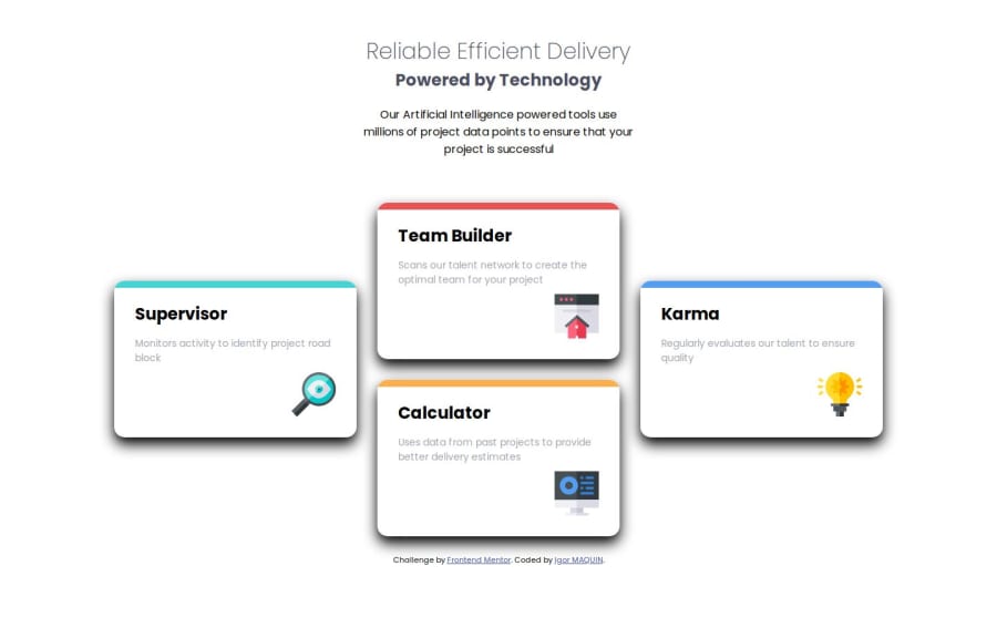
- Fixed card size (I don't like it very much)
- Font size and weight are incorrect (it's still fine)
- The shadows are very thick
- The order of cards is incorrect in the desktop layout
Things I like:
- Good HTML design (simple and straightforward)
- Clear and very understandable CSS at a glance
Keep it up!

Join our Discord community
Join thousands of Frontend Mentor community members taking the challenges, sharing resources, helping each other, and chatting about all things front-end!
Join our Discord