Frontend Mentor Four Card Feature Challenge
Design comparison
Solution retrospective
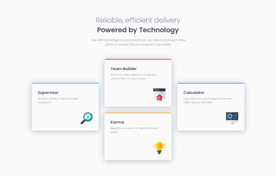
I planned to use only flexbox in this challenge. Everything worked without a problem until I got to the desktop version. I got stuck with one issue. The last card seemed to get to the max width before the other three and messed up the padding right at the break point. Once past the break point by about 10px everything worked flowless. Spent hours trying to fix it but was not able. The positive outcome was, I learned a ton on flexbox. The solution was to switch to grid. And that was my first idea but just wanted the challenge of doing it in flexbox. With grid the solution was done in just few minutes.
Community feedback
- @ManshiporiyaPosted about 2 months ago
- Semantic HTML Usage: Strengths: Your HTML structure includes appropriate headings (<h1>, <h2>, <h3>) and paragraph tags (<p>), which contribute to a well-structured, semantic layout. The card elements also make sense in the context of the content. Improvements: Consider using section or article tags around each .card to further emphasize the structure, particularly if these sections are self-contained and reusable across pages. This will improve the document's semantic meaning.
- Accessibility Considerations: Alt Text for Images: You have included alt attributes for the images, which is excellent for accessibility. However, make sure that the descriptions are more descriptive to visually impaired users (e.g., alt="A supervisor monitoring activity" instead of just alt="supervisor"). Improvement Suggestions: Ensure sufficient contrast between text and background colors for readability. You might also add aria-labels for any interactive elements in the future to improve screen reader support. Keyboard Navigation: It’s essential to think about whether your cards are focusable if they are supposed to be interactive. If they lead to more information, consider using anchor tags.
- Layout on Various Screen Sizes: Strengths: The use of flex-wrap allows the cards to adjust nicely as the viewport changes, and you've made good use of align-self to create an appealing staggered look. Challenges Encountered: You mentioned an issue with flexbox on desktop size and that switching to grid was a quick fix. This is quite common; grid provides better control for more complex layouts where items need to align in multiple directions. It’s commendable that you stuck with flexbox for the learning experience, as it teaches you about its limitations and strengths. Suggestions for Improvement: If the breakpoint issue persists, it might help to define more explicit max-width values or use a media query to adjust the flex properties as needed. However, the decision to switch to Grid is a very effective one for simplifying complex layouts. You could also combine flexbox and grid if that better suits your needs.
- Code Structure, Readability, and Reusability: Strengths: Your code is well-structured and easy to follow. You’ve named the classes clearly, which makes your CSS readable and understandable. Using flex-basis and aligning each card differently shows a strong understanding of flexbox's capabilities. Improvements: Consider using CSS variables for repeating colors (like the border colors) to enhance maintainability and reusability of the code. This will make future changes easier if you need to adjust the color scheme.
- Does the Solution Differ Considerably from the Design? Visual Differences: The design is largely on point, and the staggered card layout reflects the given design well. The choice to align cards differently was a creative solution and keeps the visual interest high. Padding Issue: The padding discrepancy you mentioned is a common issue in responsive design with flexbox. It could stem from how the browser calculates the space for flex items and rounding differences in dimensions. Using CSS Grid, you’ve overcome that challenge effectively, and that aligns better with the design. Additional Suggestions: Grid vs. Flexbox: It’s great that you took the time to try solving the challenge using flexbox only. Flexbox is very powerful but can sometimes create these minor issues when dealing with more complex layouts. Grid was designed for more two-dimensional layouts and was the right choice for what you needed. Testing in Different Browsers: If possible, test your solution in different browsers and devices to ensure consistent results. Browser inconsistencies could have contributed to the issue you experienced at the breakpoint. Summary: Your solution is strong, and you demonstrated perseverance in trying to solve a problem in multiple ways. You learned a lot from the process, which will help in deciding when to use flexbox or grid in the future. Moving to CSS Grid was a pragmatic choice, and it’s often beneficial to combine both layout techniques to get the best results. The positive outcome of your learning experience will certainly help you navigate similar challenges effectively in future projects. Great job, and keep up the effort to challenge yourself with new techniques!
1@kassahunAmdiePosted about 2 months ago@Manshiporiya Thank you so much for taking the time and the excellent feedback. I will definitely work on the suggestions in the next challenges. I appreciated your thoughts very much.
0
Please log in to post a comment
Log in with GitHubJoin our Discord community
Join thousands of Frontend Mentor community members taking the challenges, sharing resources, helping each other, and chatting about all things front-end!
Join our Discord