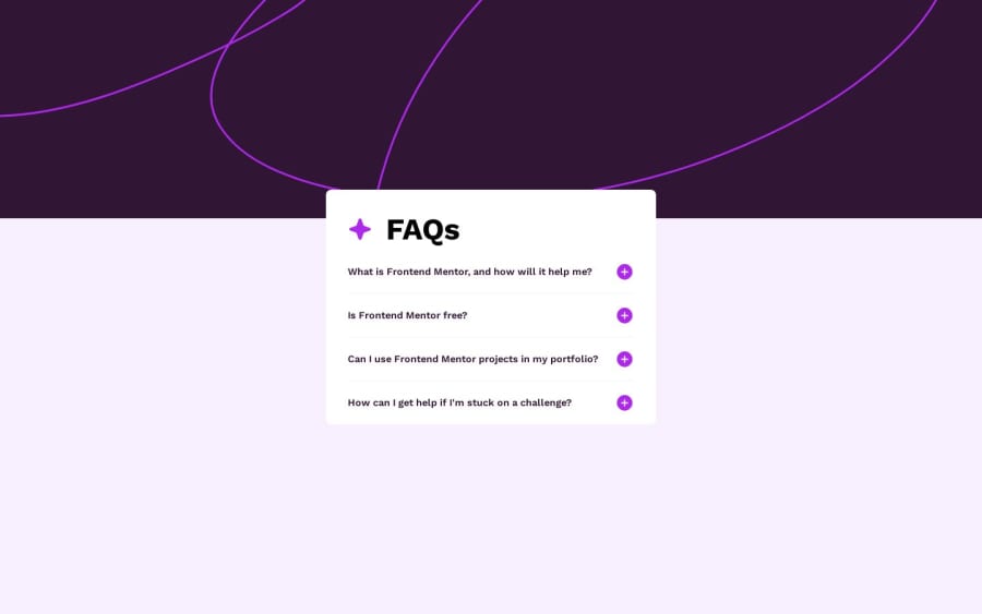
Frontend Mentor - FAQ accordion solution
Design comparison
Solution retrospective
I have tried to make this accessible for screen readers and also implemented keyboard navigation.
Firefox has only supported the :has selector today - (19/12/2023) - so you may need to update firefox to get the animation to work.
A fun challenge.
Please log in to post a comment
Log in with GitHubCommunity feedback
- @grace-snow
You must never ever put aria-label on headings!! The FAQs is fine as a heading. Do not over engineer or throw aria at code when it is not needed
Marked as helpful
Join our Discord community
Join thousands of Frontend Mentor community members taking the challenges, sharing resources, helping each other, and chatting about all things front-end!
Join our Discord
