Submitted over 2 years ago
Frontend Mentor | Expenses chart component
@Youngtechie
Design comparison
SolutionDesign
Solution retrospective
Any changes to make?
Community feedback
- @DimiPavlovPosted over 2 years ago
Hello Olaegbe, well done completing the challenge.
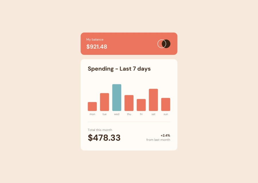
Maybe you can make some small overall cosmetic changes:- add some padding to your main component.
- days of the week color seems to be different.
- include some extra margin in between the elements.
- add 'cursor: pointer' when hovering over the charts, it will increase the user experience.
I love how you have added the GitHub link inside the component, looks really nice.
1@YoungtechiePosted over 2 years ago@DimiPavlov I will work on that and do the adjustments. Thanks for this feedback.
0
Please log in to post a comment
Log in with GitHubJoin our Discord community
Join thousands of Frontend Mentor community members taking the challenges, sharing resources, helping each other, and chatting about all things front-end!
Join our Discord
