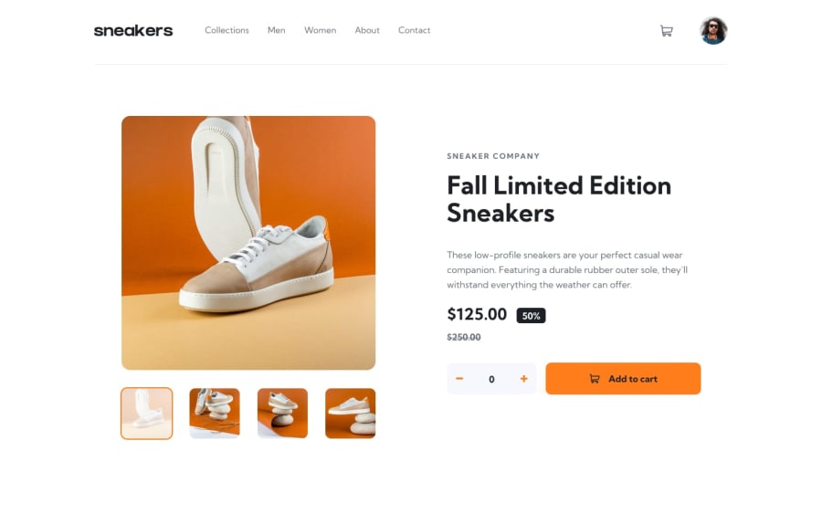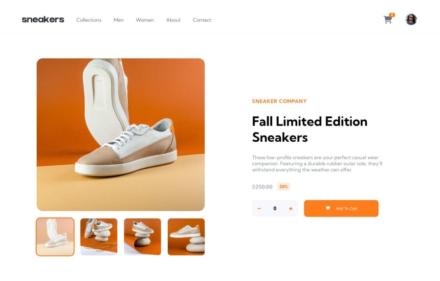
Design comparison
Solution retrospective
I believe I have successfully completed this project using JavaScript functions and the Document Object Model (DOM).
It was truly a fantastic learning experience!
Here's the text made more aesthetically pleasing for you.
Community feedback
- @AyoubrabiaePosted about 1 year ago
Hi Guga,
I've reviewed your code and the preview, and I must say you're doing an excellent job with the challenge. However, I do have some suggestions that can make your app even better.
Firstly, let's address the styling issues:
- The images container, specifically the .left-side element, is quite large, making it difficult to see. Even when I click on an image and the popup version appears, I find it challenging to close it because I can't easily locate the close button. To improve this, you can add a maximum width to the .left-side class like this:
.left-side { width: 100%; max-width: 400px; }
- In the navigation menu, when I click on a link, it quickly acquires an orange border. To enhance this interaction, you can add a transition effect to make it smoother.
Now, let's move on to scripting:
-
When selecting a quantity, it's currently possible to choose a negative number. It would be wise to add a simple check to prevent users from selecting negative quantities.
-
Another issue I noticed is that when I select a valid quantity and add a product to the cart, the quantity remains the same even after deleting products from the cart. To address this, you can reset the quantity to 0 when the "Add to Cart" button is clicked.
Additionally, there's a minor bug that can be easily fixed. When the cart is empty, you should display the message "The cart is empty."
I hope these suggestions help improve your app. Keep up the good work, and don't hesitate to ask if you need further assistance.
Marked as helpful0@Guga-KobakhidzePosted about 1 year ago@Ayoubrabiae
Thank you for your feedback; I'll make these adjustments with ease. I devoted six hours to this project, and although I ran out of time, I'm committed to refining it further.
1@AyoubrabiaePosted about 1 year agoThat's great, and I like the new animation that you added to the links.
Marked as helpful0
Please log in to post a comment
Log in with GitHubJoin our Discord community
Join thousands of Frontend Mentor community members taking the challenges, sharing resources, helping each other, and chatting about all things front-end!
Join our Discord