Frontend Mentor | Easybank landing page (mobile first)
Design comparison
Community feedback
- @grace-snowPosted almost 4 years ago
Hi Marco,
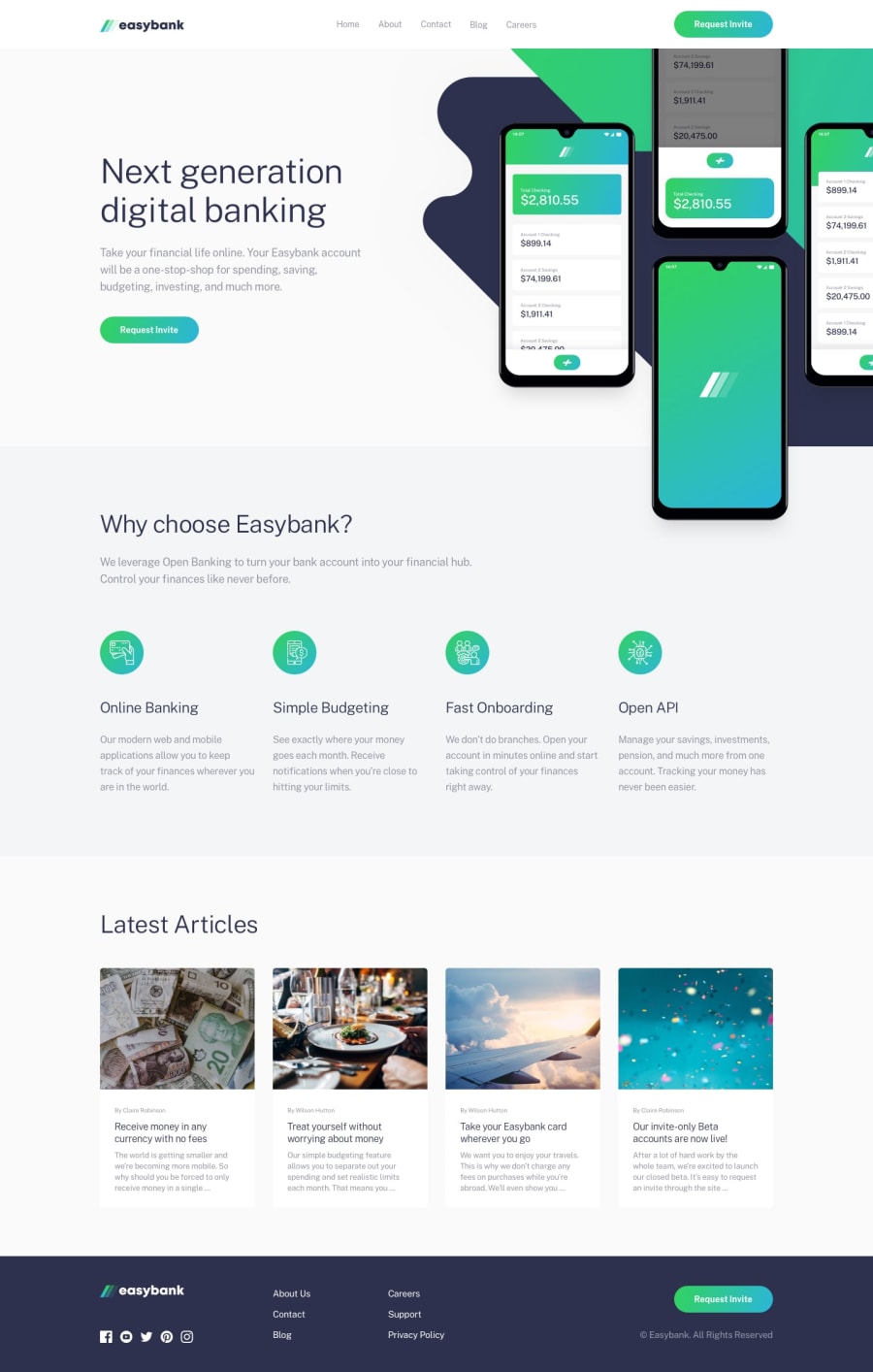
I think you should go back through this and give a little more attention to small details throughout to make it like the design. (eg the hero on desktop)
At the moment the hero and nav is broken for me on mobile and it's not accessible as you've not used an interactive element for the burger or linked it to what it controls in any way. These are small things and easy to fix.
Why I say go back through the code though, is because I can notice lots of small things in css that are unnecessary, like changing font sizes a lot at different breakpoints. There is a lot of repetition that could be removed, or styles that could be inherited from higher up the dom. I can also see you're using font weights that aren't in the project which is making your solution look different to the design.
If you go back through it, inspecting in dev tools I'm sure you'll find lots of improvements to make the code leaner.
Best of luck with it
2@grace-snowPosted almost 4 years agoOh and if you are really keen to have font sizes change, read up on using clamp function, just make sure you include a fallback font size on the line before
0@MarcoCarpoPosted almost 4 years ago@grace-snow Hi! I think you are right. These days I am rewriting all the styles of the project, I will reload it when I have corrected all the errors. Also, I'm learning how to use clamp, and I have to say it looks great! i think i will always implement it in future projects! thanks!
0
Please log in to post a comment
Log in with GitHubJoin our Discord community
Join thousands of Frontend Mentor community members taking the challenges, sharing resources, helping each other, and chatting about all things front-end!
Join our Discord
