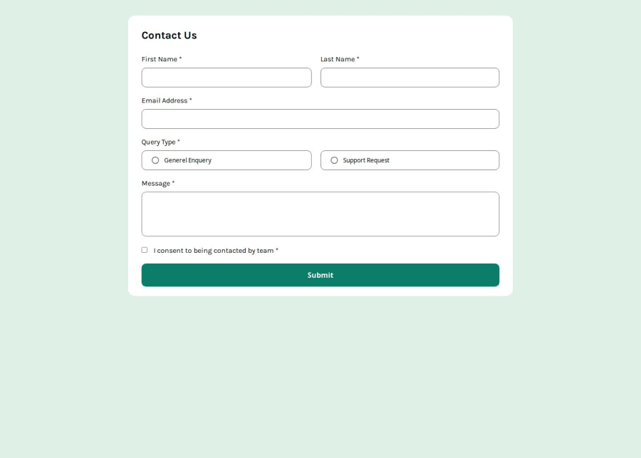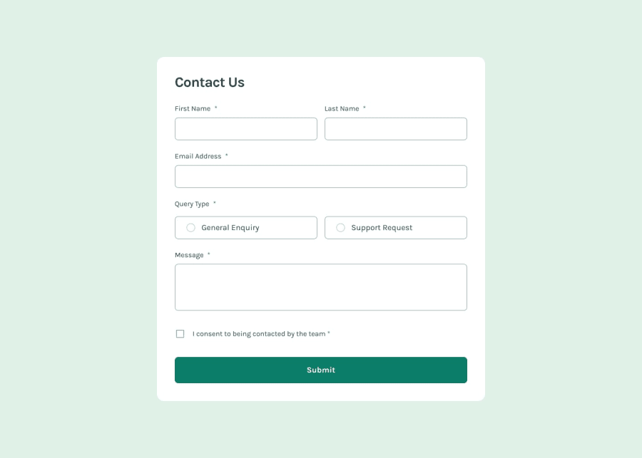
Design comparison
SolutionDesign
Please log in to post a comment
Log in with GitHubCommunity feedback
- @sherimin
🎉Good solution! You may want to adjust the padding and layout for the two query types on smaller screens to enhance readability. Right now, the text is a bit hidden if I narrow down the screens.
Join our Discord community
Join thousands of Frontend Mentor community members taking the challenges, sharing resources, helping each other, and chatting about all things front-end!
Join our Discord
