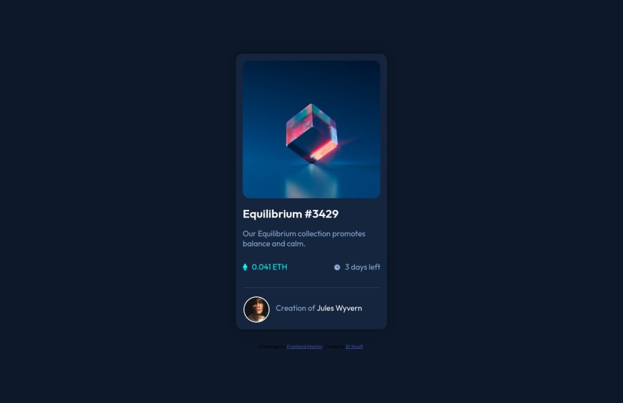
Frontend Mentor Challenges - NFT preview card component
Design comparison
Solution retrospective
This was my second challenge to do, so if you find any bugs or a way I can improve my code, feel free to let me know.
Community feedback
- @AdrianoEscarabotePosted about 2 years ago
Hi EL YOUSFI, how are you?
I really liked the result of your project, but I have some tips that I think you will enjoy:
- every Html document must contain the main tag, so we can identify the main content, to fix this, wrap all the content with the main tag. HTML5 landmark elements are used to improve navigation experience on your site for users of assistive technology.
- to remove the scrollbar, we can do this:
body {
    padding: 1rem;
    margin: 0;
}
The rest is great!
I hope it helps... 👍
Marked as helpful0 - @VCaramesPosted about 2 years ago
Hey there! 👋 Here are some suggestions to help improve your code:
-
To better specify the main content of you site you will want to encase your entire component inside a Main Element.
-
The NFT Alt Tag description needs to be improved upon. You want to describe what the image is; they need to be readable. Assume you’re describing the image/icon to someone.
-
Wrap the "NFT image", "Equilibrium #3429" and "Jules Wyvern" in an Anchor Tags <a>. The anchor tag will allow users to click on content and have them directed to another part of your site.
If you have any questions or need further clarification, let me know.
Happy Coding! 👻🎃
Marked as helpful0 -
Please log in to post a comment
Log in with GitHubJoin our Discord community
Join thousands of Frontend Mentor community members taking the challenges, sharing resources, helping each other, and chatting about all things front-end!
Join our Discord
