Design comparison
Solution retrospective
I implemented some of the advice given to me on my last few challeges, and i would like to know if i did better this time :).
What specific areas of your project would you like help with?-
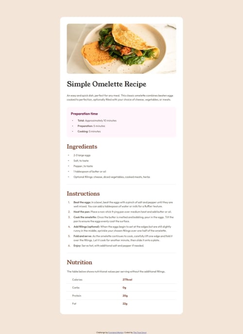
The list elements. I took a very round about way to fix two things- one of them being changing the width of the bullet points. I used
li:marker { width: 0.3rem; }
but it did not change the size. the second thing was the space between theli
and the text. For both theol
and theul
, I used the pseudo element::before
to make that space(and changing the size of the bullets), but it got much more complicated with theol
and the code got longer than I'd have wanted it to. If there's a better way to fix these, please tell me. -
Is there a way to increase space between
li
elements without turningul
orol
into flex elements? I don't thinkgap:
works without flex( I could be mistaken.)
Community feedback
- @Zelos23Posted 2 months ago
This feels really good and accurate. The use of the :marker pseudo-selector is correct in my opinion, you can try to style the bullet by changing font size instead of width and see if the outcome is similar, but visually to me seems ok. to make space between bullets and the element i did just with padding left in the ul/ol and in li elements without the pseudo elements sure there are many other ways but in this case i thought it would be a good compromise. Don't know if there is a way to achieve the spacing needed automatically without flex, maybe with hard coded values and eye tuning; and yes gap is a property enabled by flex containers. Great job by the way, congrats!
1 - @StroudyPosted 2 months ago
Awesome job tackling this challenge! You’re doing amazing, and I wanted to share a couple of suggestions that might help refine your approach…
-
Using a
<main>
tag inside the<body>
of your HTML is a best practice because it clearly identifies the main content of your page. This helps with accessibility and improves how search engines understand your content. -
Using
font-display: swap
in your@font-face
rule improves performance by showing fallback text until the custom font loads, preventing a blank screen (flash of invisible text). The downside is a brief flash when the font switches, but it’s usually better than waiting for text to appear. -
Using a full modern CSS reset is beneficial because it removes default browser styling, creating a consistent starting point for your design across all browsers. It helps avoid unexpected layout issues and makes your styles more predictable, ensuring a uniform appearance on different devices and platforms, check out this site for a Full modern reset
-
Using
rem
orem
units in@media
queries is better thanpx
because they are relative units that adapt to user settings, like their preferred font size. This makes your design more responsive and accessible, ensuring it looks good on different devices and respects user preferences. -
I think you can benefit from using a naming convention like BEM (Block, Element, Modifier) is beneficial because it makes your CSS more organized, readable, and easier to maintain. BEM helps you clearly understand the purpose of each class, avoid naming conflicts, and create reusable components, leading to a more scalable codebase. For more details BEM,
You’re doing fantastic! I hope these tips help you as you continue your coding journey. Stay curious and keep experimenting—every challenge is an opportunity to learn. Have fun, and keep coding with confidence! 🌟
0 -
Please log in to post a comment
Log in with GitHubJoin our Discord community
Join thousands of Frontend Mentor community members taking the challenges, sharing resources, helping each other, and chatting about all things front-end!
Join our Discord