

Design comparison

Solution retrospective
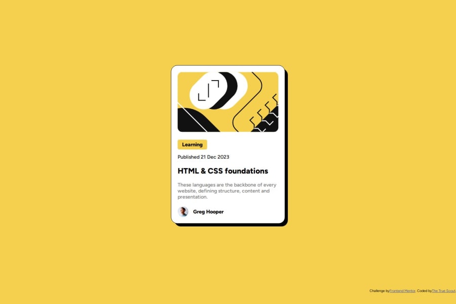
the background on 'Learning'. I tried using a class to make it, but because it's a block element, it filled up the whole space. So a quick google search got me to use a span to do it instead.
Community feedback
- @MikDra1Posted 2 months ago
If you want to make your card responsive with ease you can use this technique:
.card {
width: 90%;
max-width: 37.5rem;
}
On the smaller screens card will be 90% of the parent (here body), but as soon as the card will be 37.5rem (600px) it will lock with this size.
Also to put the card in the center I advise you to use this code snippet:
.container {
display: grid;
place-items: center;
}
Hope you found this comment helpful 💗💗💗
Good job and keep going 😁😊😉
Marked as helpful0@TheTrueScoutPosted 2 months ago@MikDra1 Thanks! That's helpful! For the second one, it centers the container on the x and y of the page, or the contents in the container?
0@MikDra1Posted 2 months ago@TheTrueScout
It centers the content of the container (you can use the body as your container) 😁
Marked as helpful0 - @StroudyPosted 2 months ago
Awesome job tackling this challenge! You’re doing amazing, and I wanted to share a couple of suggestions that might help refine your approach…
-
Your heading elements
<h3><h2><h1>, Heading elements should be in sequentially-descending order (e.g.,<h1>,<h2>,<h3>) to create a clear content structure, improving accessibility and SEO. Skipping levels or using them out of order can confuse screen readers, affect search engine rankings, and make your content harder to understand. -
For future project, You could downloading and host your own fonts using
@font-faceimproves website performance by reducing external requests, provides more control over font usage, ensures consistency across browsers, enhances offline availability, and avoids potential issues if third-party font services become unavailable. Place to get .woff2 fonts -
Developers should avoid using pixels (
px) because they are a fixed size and don't scale well on different devices. Instead, useremorem, which are relative units that adjust based on user settings, making your design more flexible, responsive, and accessible. For more information check out this, Why font-size must NEVER be in pixels or this video by Kevin Powell CSS em and rem explained.- Another great resource for px to rem converter. -
Using
max-width: 100%ormin-width: 100%is more responsive than justwidth: 100%because they allow elements to adjust better to different screen sizes. To learn more, check out this article: responsive-meaning. -
Using
remoremunits in@mediaqueries is better thanpxbecause they are relative units that adapt to user settings, like their preferred font size. This makes your design more responsive and accessible, ensuring it looks good on different devices and respects user preferences.
You’re doing fantastic! I hope these tips help you as you continue your coding journey. Stay curious and keep experimenting—every challenge is an opportunity to learn. Have fun, and keep coding with confidence! 🌟
0 -


Please log in to post a comment
Log in with GitHub
Join our Discord community
Join thousands of Frontend Mentor community members taking the challenges, sharing resources, helping each other, and chatting about all things front-end!
Join our Discord