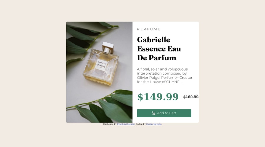
Frontend Mentor Challenge #1: Product Preview card component
Design comparison
Solution retrospective
For you, how did you resolve the break lines and change image between desktop and mobile views?
Community feedback
- @correlucasPosted about 2 years ago
👾Hello @CarlosNaveda, Congratulations on completing this challenge!
Your solution its almost done and I’ve some tips to help you to improve it:
Use the THE PICTURE TAG that is a shortcut to deal with the multiple images in this challenge. So you can use the
<picture>tag instead of importing this as an<img>or using a div withbackground-image. Use it to place the images and make the change between mobile and desktop, instead of using adivorimgand set the change in the css withdisplay: nonewith the tag picture is more practical and easy. Note that for SEO / search engine reasons isn’t a better practice import this product image with CSS since this will make it harder to the image. Manage both images inside the<picture>tag and use the html to code to set when the images should change setting the devicemax-widthdepending of the device desktop + mobile.Check the link for the official documentation for
<picture>in W3 SCHOOLS:https://www.w3schools.com/tags/tag_picture.aspSee the example below:
<picture> <source media="(max-width:650px)" srcset="./images/image-product-mobile.jpg"> <img src="./images/image-product-desktop.jpg" alt="Gabrielle Parfum" style="width:auto;"> </picture>👨💻Here's my solution for this challenge if you wants to see how I build it: https://www.frontendmentor.io/solutions/product-preview-card-vanilla-css-and-custom-hover-state-on-hero-85A1JsueD1
✌️ I hope this helps you and happy coding!
Marked as helpful1@CarlosNavedaPosted about 2 years ago@correlucas Thx a lot, I will read your code and learn about it, really thanks for the feedback, I appreciate it.
0@CarlosNavedaPosted about 2 years ago@correlucas Hi, can you give me again your solution, I try to use the link, but it seems that is broken.
0@CarlosNavedaPosted about 2 years ago@correlucas thx, I read the documentation and fixed my code.
0 - @VCaramesPosted about 2 years ago
Hey there! 👋 Here are some suggestions to help improve your code:
-
Apply the recommendations that the other member mentioned, before moving on to the next challenge, so you do not make the same mistakes.
-
Apply a
border-radiusalong withoverflow: hiddento the Body Element to better match the FEM example. -
The Alt Tag Description for the image needs to be improved upon. You want to describe what the image is; they need to be readable. Assume you’re describing the image to someone.
-
The only heading in this challenge is the name of the perfume, “Gabrielle Essence Eau De Parfum” . The rest of the text should be wrapped in a Paragraph Element.
-
The old price 🏷 is not being announced properly to screen readers. You want to wrap it in a Del Element and include a sr-only text explaining that this is the old price.
-
Your button needs to have
box-shadow,cursor: pointer,:hoverand:focus-visible. -
Implement a Mobile First approach 📱 > 🖥
With mobile devices being the predominant way that people view websites/content. It is more crucial than ever to ensure that your website/content looks presentable on all mobile devices. To achieve this, you start building your website/content for smaller screen first and then adjust your content for larger screens.
If you have any questions or need further clarification, let me know.
Happy Coding! 👻🎃
Marked as helpful0@CarlosNavedaPosted about 2 years ago@vcarames Hi
Fixes:
- I applied the recommendations - OK
- I applied the border radius to my class="previewCard" instead of "body", it fix the borders of the card.
Recommendations which I need plz an example:
-About "Alt Tag Description", can you give an example, cuz I write = "Perfume-images", I think is a good description, I guess. -About "Del Element", I can't understand it, can you give me plz an example.
I will use in next Challenges:
-About to use Paragraph Element. -About to Buttons.
0@VCaramesPosted about 2 years ago@CarlosNaveda
For the alt description. You want to describe the image to someone who cannot see the image. What's the shape of the bottle, what color is it, what's around it, etc...
For the old price, you want wrap the price on a del element. Inside that del element you will also include a span element with an sr-only class (screen reader) that states something like, "the old price was". After that, you will use CSS to hide that class so its only visible to screen readers.
So it should look something like this.
<del>
<span class="sr-only">The old price was</span>
$169.99
</del>
0 -
Please log in to post a comment
Log in with GitHubJoin our Discord community
Join thousands of Frontend Mentor community members taking the challenges, sharing resources, helping each other, and chatting about all things front-end!
Join our Discord
