Submitted almost 3 years ago
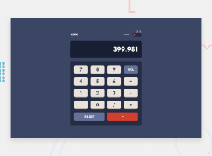
Frontend Mentor - Calculator app using SASS, mobile-first design
@liezsm
Design comparison
SolutionDesign
Solution retrospective
Any feedback will do as it helps me grow 🙂. Thanks in advance. Sending love and light to all devs❤
Community feedback
- @fraserwatPosted almost 3 years ago
Hey - this is great!!
Couple of things id change:
- To make it more usable for people with screen readers etc, either add labels that aren't visible, or (probably easier) put in a
aria-label="what the button does here"attribute into the HTML. - Change the cursor to a pointer over the calculator buttons - this better indicates interactivity to the user
- I think the background-color on the first themes hover is too dark
You could also look into what semantic HTML elements you could use instead of a div in
.keys-container, but aside from that all looks great!Keep up the hard work!!
Fraser
Marked as helpful0@liezsmPosted almost 3 years ago@fraserwat thanks! really appreciate your feedback and suggestions, I'll work on it 🙂
0 - To make it more usable for people with screen readers etc, either add labels that aren't visible, or (probably easier) put in a
Please log in to post a comment
Log in with GitHubJoin our Discord community
Join thousands of Frontend Mentor community members taking the challenges, sharing resources, helping each other, and chatting about all things front-end!
Join our Discord
