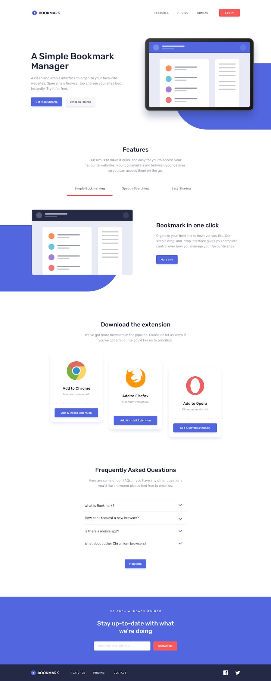
Design comparison
SolutionDesign
Community feedback
- @deanhopesPosted about 4 years ago
8/10
What you did well
- Almost perfect, well done
- Good sense of layout
Room for improvements
- Everything is ever so slightly larger than it should be. This pushes everything down and creates a larger page.
- White space between the header and body text is slightly off. Make sure you measure this in the future.
- Main colours slightly off (but this might be the screenshot so my apologies if so)
- Navbar text size too big
- "Simple bookmarking" in the "features" section should be black when active
- "Download the extension" cards too big
You're pretty much there. It's those tiny changes that will get you to 'pixel perfect'.
1
Please log in to post a comment
Log in with GitHubJoin our Discord community
Join thousands of Frontend Mentor community members taking the challenges, sharing resources, helping each other, and chatting about all things front-end!
Join our Discord
