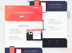
Design comparison
Solution retrospective
This is my first time building this kind of website so i have a few questions:
First how do i prevent the contents of my website especially the bg image/color from being squeezed whenever i open the keyboard in mobile phone what i want is if open my keyboard in mobile phone all of the contents will just stay behind the keyboard.
second what is better for layout flex or grid?
third second what is the better approach in moving to illustrations in this website?
fourth what is better for fluid typography vh or vw?
and last is it better to use rem, em and px in for height of the container than vh?
thank you
Community feedback
Please log in to post a comment
Log in with GitHubJoin our Discord community
Join thousands of Frontend Mentor community members taking the challenges, sharing resources, helping each other, and chatting about all things front-end!
Join our Discord
