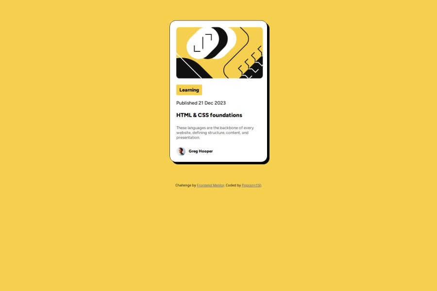
Design comparison
Solution retrospective
I'm very proud of the way my work came out in the end, since I've done something similar to this I was more confident I could take this on.
What challenges did you encounter, and how did you overcome them?I had issues with centering the 'sub-container' (e.g. Image) but i was able to overcome this by putting the image in a div tag then centering that div tag. Boom! The image was centered, fun :)
What specific areas of your project would you like help with?Usage of flex box and centering items on screen.. Vertically & Horizontally.
Community feedback
- @MohammadSoleimanikiaPosted 3 months ago
well done, you did a great job, if you are new to flex box I recomend this website to you :https://flexboxfroggy.com/
Marked as helpful1 - @mahbtPosted 3 months ago
Great work on your project, especially in overcoming the centering challenge with the image. Instead of using margin, I usually apply Flexbox on the body to handle centering, which works perfectly for both vertical and horizontal alignment.
Marked as helpful1@popcorn150Posted 3 months ago@mahbt yeah it'll deal with applying them individually instead right.. that's another idea, thanks.
0
Please log in to post a comment
Log in with GitHubJoin our Discord community
Join thousands of Frontend Mentor community members taking the challenges, sharing resources, helping each other, and chatting about all things front-end!
Join our Discord
