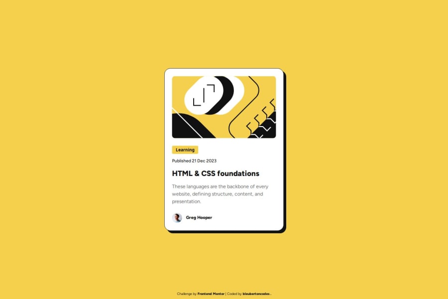
Design comparison
Solution retrospective
What I am most proud of with this challenge is getting more familiar with using Figma design files, as well as being more efficient when completing the challenge. What I would do differently next time is to take small breaks when I get stuck on something rather than trying to force a solution. Taking a break when I get stuck gives me a new perspective and helps me more easily fix the issue.
What challenges did you encounter, and how did you overcome them?I still get slightly confused on what containers to use Flexbox on to get the results I am looking forand when to use positining vs. flexbox vs. margin:auto to center the main content/element. To overcome these obstacles, I used MDN documentation as well as watch some tutorials about the topic.
What specific areas of your project would you like help with?I feel like I completed this challenge in its entirety and would like general feedback on my execution of it. Is my HTML semantic enough, code organization/readability, etc.
Community feedback
Please log in to post a comment
Log in with GitHubJoin our Discord community
Join thousands of Frontend Mentor community members taking the challenges, sharing resources, helping each other, and chatting about all things front-end!
Join our Discord
