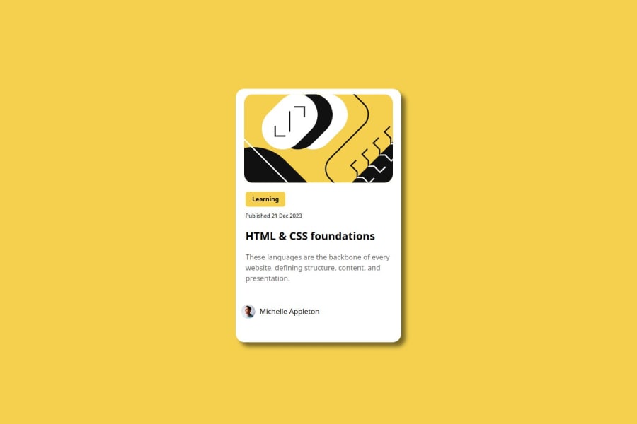
Design comparison
Solution retrospective
I'm proud of how I started to understand the Figma designs more easily.
What challenges did you encounter, and how did you overcome them?I haven't written any code in the last 2 weeks so it took me sometime to remember where I'm
Community feedback
- @LolontorPosted 5 months ago
Great work, bravo! Try using relative units like em and rem instead of fixed units like px. Use min-height instead of height for your body. Reduce spacing between course description and author's profile.
0 - @MenesesMGPosted 5 months ago
This is great! Although not an exact replica of the original, it's a great take based on what you have learned.
0
Please log in to post a comment
Log in with GitHubJoin our Discord community
Join thousands of Frontend Mentor community members taking the challenges, sharing resources, helping each other, and chatting about all things front-end!
Join our Discord
