Design comparison
SolutionDesign
Community feedback
- @wendykrwnPosted 6 months ago
Nice preview! But if you want to improve it :
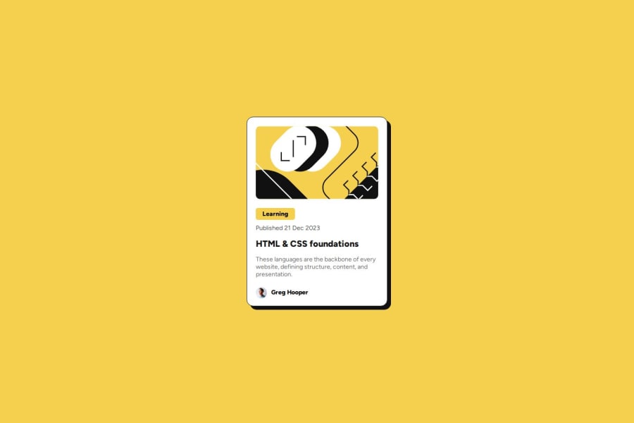
- Avoid hardcoding the size of the card. It would have been better to base it on the height of the article image.
- Add responsive.
- When hovering it must be on the entire card.
0
Please log in to post a comment
Log in with GitHubJoin our Discord community
Join thousands of Frontend Mentor community members taking the challenges, sharing resources, helping each other, and chatting about all things front-end!
Join our Discord
