

Design comparison

Solution retrospective
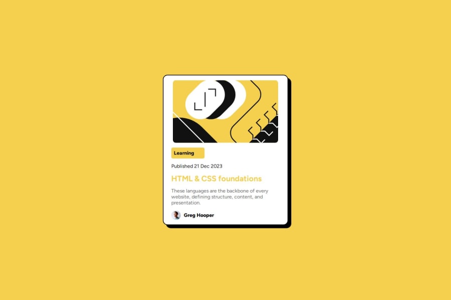
I'm proud to have lined up all the elements properly.
What challenges did you encounter, and how did you overcome them?I had a little trouble aligning the elements
What specific areas of your project would you like help with?I'd like to see if there's an easier way to align the elements.
Community feedback
- @luiseduardo85Posted 9 days ago
First i recommend you to try fix the size, more height and less width.
Review your concept about display flex and position, I think when you use flexbox you dont need to use position.
.box-card { display: flex; flex-direction: column; align-items: center; position: absolute; top: 50%; left: 50%; transform: translate(-50%, -50%); background: #fff; padding: 15px; border: 2px solid black; border-radius: 15px; width: 100%; max-width: 400px; box-shadow: 10px 10px; transition: 0.8s; }
in this .box-card i cant see how to use properly flexbox and position you should choose one or another.
Other suggest use css in a diffent file, your html will be more cleaner and easy to understand.
Marked as helpful1@PxMachPosted 9 days ago@luiseduardo85 if you have time, you can go and see, Thanks
0

Please log in to post a comment
Log in with GitHubJoin our Discord community
Join thousands of Frontend Mentor community members taking the challenges, sharing resources, helping each other, and chatting about all things front-end!
Join our Discord