Not Found
Not Found
Not Found
Not Found
Not Found
Not Found
Not Found
Not Found
Not Found
Not Found
Not Found
Not Found
Not Found
Not Found
Not Found
Not Found
Not Found
Not Found
Not Found
Not Found

Submitted

Frontend Mentor Blog Card Preview

Aamir Khan 130

@Aamnbaba

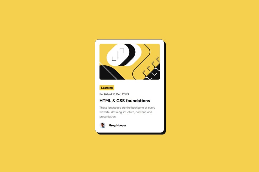
Desktop design screenshot for the Blog preview card coding challenge

This is a solution for...

  • HTML
  • CSS
1newbie
View challenge

Design comparison


SolutionDesign

Solution retrospective


What are you most proud of, and what would you do differently next time?

I am happy to use figma in this project first time. By using it, things done quickly and perfect.

What challenges did you encounter, and how did you overcome them?

Layout Designing was a tough part in the begining. Creating Semantic classes and their use are the most challenging work to complete a project as soon as possible. I have faced new challenge about the responsivness of the web. I realized that how it works by playing with the width and height of a div especially img or svg elements.

What specific areas of your project would you like help with?

The layoust deployment in the begning is difficult for me as I am trying to crack this to feel confident in the start.

Community feedback

@weldu0

Posted

👋 Hey, @Aamnbaba! I have a few suggestions for your project:

Use <picture> for Responsive Images

<picture>
  <source srcset="images/desktop.jpg" media="(min-width: 48rem)">
  <source srcset="images/mobile.jpg" media="(max-width: 47.99rem)">
  <img src="images/desktop.jpg" alt="Product image">
</picture>

The above markup tells the browser to use images/mobile.jpg if the viewport width is less than 48rem. Otherwise, it will use images/desktop.jpg as the default image.

If you want to learn more about the <picture> element, here's the MDN documentation. 📚

Correct Media Query Syntax

The media query syntax you've used contains an error. The @media rule should not be nested directly. Instead, write your media queries as separate blocks. Here's how to correctly structure your media queries:

@media (max-width: 1440px) {
    ...
}

@media (max-width: 375px) {
   ...
}

For more details about media queries, you can check out the MDN documentation on @media.

I hope this helped you :).

Marked as helpful

1

Aamir Khan 130

@Aamnbaba

Posted

@weldu0 Thank you, It helps. I will update my work soon.

0

@weldu0

Posted

You're welcome! I'm glad to hear that it was helpful. If you have any questions, feel free to ask me. @Aamnbaba"

0
Aamir Khan 130

@Aamnbaba

Posted

Sure. @weldu0

0

Please log in to post a comment

Log in with GitHub
Discord logo

Join our Discord community

Join thousands of Frontend Mentor community members taking the challenges, sharing resources, helping each other, and chatting about all things front-end!

Join our Discord