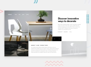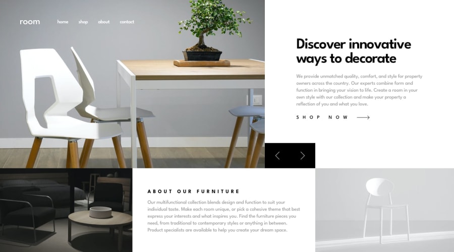
Design comparison
Solution retrospective
Did you liked it?? It's my first solution
Community feedback
- @AryaAnish121Posted almost 4 years ago
ok thank you but I didn't understood x icon do you mean favicon if yes it's the first solution I didn't know if the frontendmentor's same favicon that is mandatory. I will change it.
Please like it.
Thank you!
2@gacburPosted almost 4 years ago@AryaAnish121 Yes, sorry, I meant favicon :) that's right. no problem, have a great day!
1 - @ApplePieGiraffePosted almost 4 years ago
Hey, Arya Anish! 👋
Congratulations upon completing your first Frontend Mentor challenge! 🎉 Good work on this one! 👍
The transition of the mobile menu icon is pretty cool! 😎
I suggest,
- Giving the hero slider images a fixed height so that their height doesn't change and move some of the content around when changing slides.
- Decreasing the space around the sides of the hero text to the left of the slider to give the heading and paragraph some more room (as in the original design).
- Making the color of the mobile menu icon bars white so that they stand out against the slider images better and are easier to see.
Keep coding (and happy coding, too)! 😁
1@AryaAnish121Posted almost 4 years ago@ApplePieGiraffe thank you for the suggestion I am too new please help me:-
I gave them a fixed height but it always changes but in my computer and my smartphone it didn't change and about bars, I will do it, Thank you
1@ApplePieGiraffePosted almost 4 years ago@AryaAnish121
After taking a look in Chrome's dev tools, you might be able to solve this issue by adding
height: 495px(or something similar) to the hero image and getting rid of the padding around the text content to the right (use flexbox instead to center that text in its container). Addingobject-fit: coverto the image may help keep them from distorting, too, when the page is resized. 😉Keep learning and coding! 👍
1 - @gacburPosted almost 4 years ago
Hello Arya Anish, responsiveness is well done and overall you did a good job :)
one thing is only that the x icon on the smaller screens on mobile is coming a little to close to the links :) if you could make it a little more separated it would look even more awesome.
keep up the great work!
1
Please log in to post a comment
Log in with GitHubJoin our Discord community
Join thousands of Frontend Mentor community members taking the challenges, sharing resources, helping each other, and chatting about all things front-end!
Join our Discord
