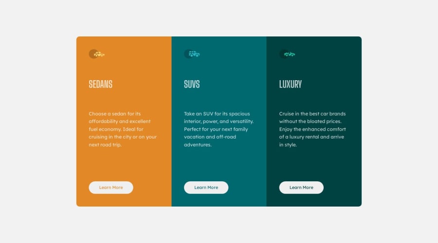
Frontend Mentor | 3-column preview card component
Design comparison
Solution retrospective
review my code please
Community feedback
- @AldrinSeanPereiraPosted 11 months ago
Very Cool! Great work so far!
problems:
- The cards vertical height is not fixed so when you resize the browser vertically the sizing is different
possible fix:
- in CSS, under
mainchange theheightproperty fromvhto aremvalue
Marked as helpful1@mayur0977Posted 11 months agoThanks for the feedback, I will fix it soon. @AldrinSeanPereira
0 - @danielmrz-devPosted 11 months ago
Hello @harishfuego33!
Your solution looks excelent!
I have just one suggestion:
- For semantic reasons, only use one
<h1>per page - this should represent the main heading/subject for the whole page. . Unlike what most people think, the difference between the HTML headings is not just about the size and weight of the text.
The
<h1>to<h6>tags are used to define HTML headings.<h1>defines the most important heading.<h6>defines the least important heading. And do not skip heading levels - start with<h1>, then use<h2>, and so on.This change has little or not effect at all on the project, but it makes your HTML code more semantic, improving SEO optimization as well as the accessibility of your project.
I hope it helps!
Other than that, you did a great job!
0 - For semantic reasons, only use one
Please log in to post a comment
Log in with GitHubJoin our Discord community
Join thousands of Frontend Mentor community members taking the challenges, sharing resources, helping each other, and chatting about all things front-end!
Join our Discord
