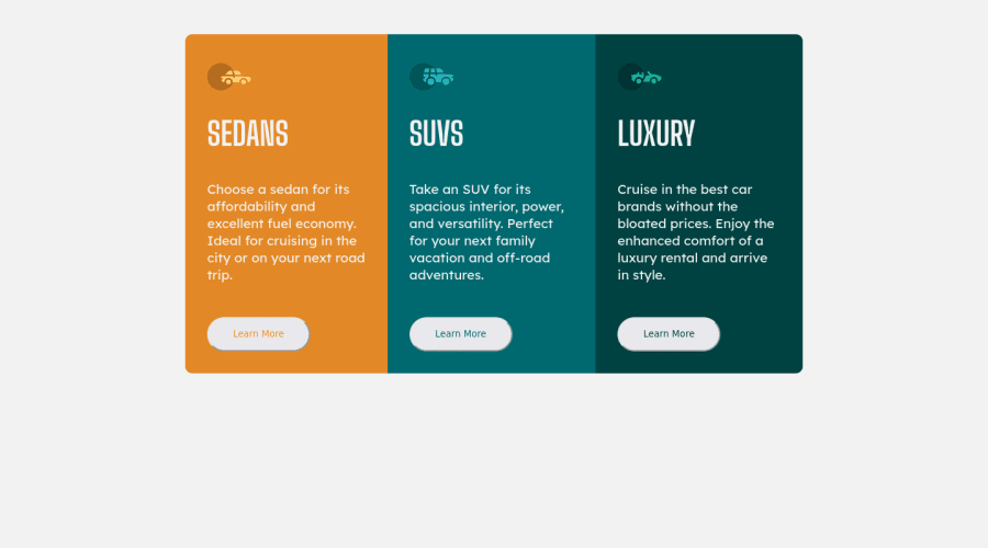
Design comparison
Solution retrospective
id like to receive any feedback
Community feedback
- @NaveenGumastePosted almost 3 years ago
Hay ! ihza Good Job on challenge
- Warp your card content around the main tag Ex: 👇
<body> <main class="container"> *all you content here* </main> </body>Have a good day and keep coding 👍!
Marked as helpful0 - @PhoenixDev22Posted almost 3 years ago
Hello @ihzavip ,
I have some suggestions regarding your solution:
-
There should be two landmark components as children of the body element - a
main(which will be the component ) and afooter(which will be the attribution).<Footer>should not be in the<main >. HTML5 landmark elements are used to improve navigation . -
About <h1> it is recommended not to have more than one h1 on the page . You can add a
<h1>withclass="sr-only"(Hidden visually, but present for assistive tech). Then use<h2>instead of<h1>
.sr-only { border: 0 !important; clip: rect(1px, 1px, 1px, 1px) !important; -webkit-clip-path: inset(50%) !important; clip-path: inset(50%) !important; height: 1px !important; margin: -1px !important; overflow: hidden !important; padding: 0 !important; position: absolute !important; width: 1px !important; white-space: nowrap !important; }-
Clicking those
"learn more"buttons would trigger navigation not do an action so button elements would not be right. And for future, it is essential if you include a button in a form element without specifying it's just a regular button, it defaults to a submit button. Though, so it's a good idea to make a habit of specifying thetype. So use<a>instead. -
For any decorative images, each img tag should have empty
alt=""as you did andaria-hidden="true"attributes to make all web assistive technologies such as screen reader ignore those images in this challenge , all the images are decorative. -
To center the component on the middle of the page , you can use the flexbox properties and
min-height: 100vhfor the<body>. -
width: 900px;an explicit width is not a good way . consider using max-width to the container that wraps the three cards. -
You should use
emandremunits .Bothemandremare flexible, Usingpxwon't allow the user to control the font size based on their needs. -
In
line-height: 25px;use unitless value for theline-height, this is the preferred way to set line-height and avoid unexpected results due to inheritance.Read more in MDN. -
General point: The best way to style that is single class selectors.
-
I would know why you did use
perspective: 1px;?
Hopefully this feedback helps.
Marked as helpful0 -
- Account deleted
Hello there! 👋
Congratulations on finishing your challenge! 🎉
I have some feedback on this solution:
- Always Use Semantic HTML instead of
divlike<main><header><footer>, etc for more info
i hope this is helpful and goodluck!
Marked as helpful0 - Always Use Semantic HTML instead of
Please log in to post a comment
Log in with GitHubJoin our Discord community
Join thousands of Frontend Mentor community members taking the challenges, sharing resources, helping each other, and chatting about all things front-end!
Join our Discord
