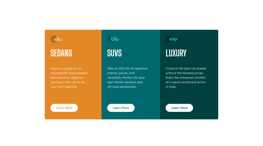
Design comparison
Solution retrospective
Couldn't work out how to add some extra marign on the left of columns without affecting the text.
Community feedback
- @correlucasPosted about 2 years ago
👾Hello @maxted83, congratulations for your new solution!
👏 Great start and great first solution! You’ve done really good work here putting everything together, I’ve some suggestions you can consider applying to your code:
1.Your solution seems fine, you did a really good work wrapping the content for these 3 cards. Something you can improve here is to use a
single classto manage the content that is mostly the same for the 3 cards (paddings, colors, margins and etc) and another class to manage the characteristics that are different (colors and icon), this way you'll have more control over then and if you need to change something you modify only one class.2.About the semantics, you can replace all blocks that you've used
<div>and replace with<article>thats a better html markup for this situation.3.Add a margin of around
margin: 20pxto avoid the card touching the screen edges while it scales down.✌️ I hope this helps you and happy coding!
Marked as helpful1 - @wllyvxPosted about 2 years ago
Hi! Nice Job! I think it's because your font sizes are too large, I opened a pull request to your repo which fixes some issues, please have a look! :)
Marked as helpful1
Please log in to post a comment
Log in with GitHubJoin our Discord community
Join thousands of Frontend Mentor community members taking the challenges, sharing resources, helping each other, and chatting about all things front-end!
Join our Discord
