Frontend Mentor | 3-column preview card component
Design comparison
Solution retrospective
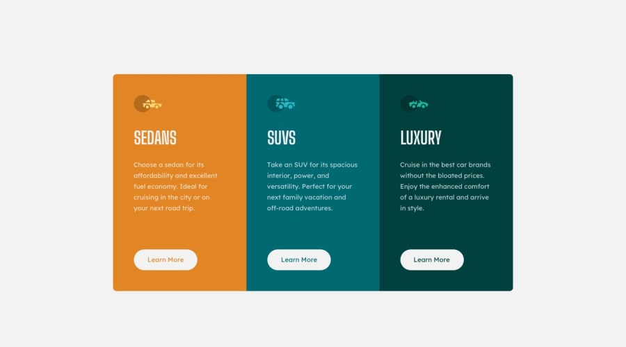
Guys, check it out and Please feel free to comment.
Community feedback
- @elaineleungPosted over 2 years ago
Hi Israel John, I think it looks good on the whole!
One comment I have is, I see that you're trying to center your component using flexbox, but things are still a bit off centered where the footer and the component are on the same row. What happened is, they're taking the default flex direction, which is
row, and all you need to do to fix that is to change the flex direction.Here's what I'd do:
- Have the
flex-directionascolumnso that the component and the footer can be stacked as 1 column. - Set either flexbox or grid in the component to make it centered, and add
flex: 1so that the component can take up the entire space. - Remove the padding on the footer, as it's always best to position elements using flex and grid properties instead of setting huge paddings and margins, which could give you issues when you go to a smaller screen.
Everything looks like this:
body {
   // add these lines
   flex-direction: column;
   justify-content: center;
}

.container {
   // add these lines
   flex: 1;
   display: flex;
   align-items: center;
}

.attribution {
   padding-top: 500px; // remove this
}
I would also add some margin between the elements in the box so that they look a bit more like the design; you can try putting a 1.5rem space between them and see. Great job on the whole!
0 - Have the
Please log in to post a comment
Log in with GitHubJoin our Discord community
Join thousands of Frontend Mentor community members taking the challenges, sharing resources, helping each other, and chatting about all things front-end!
Join our Discord
