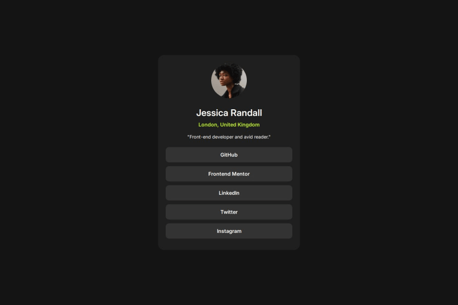
Frontend Mentor - Social links profile solution
Design comparison
Solution retrospective
I am most proud of how I successfully implemented keyboard accessibility and transitions for the social links profile project.Next time, I would allocate more time to exploring advanced CSS transitions and animations. While I managed to implement basic transitions effectively.
What challenges did you encounter, and how did you overcome them?One of the main challenges was implementing effective keyboard accessibility for all interactive elements. I had to ensure that elements were easily navigable using the keyboard, which required careful adjustments to the tab focus outline to maintain aesthetics while providing clear visibility. To overcome this, I experimented with CSS properties for focus states, ensuring that the outline was both functional and visually appealing.
What specific areas of your project would you like help with?I would love feedback on my code structure and organization. Any suggestions for improving readability, maintainability, or following best practices in HTML and CSS would be invaluable.
Community feedback
Please log in to post a comment
Log in with GitHubJoin our Discord community
Join thousands of Frontend Mentor community members taking the challenges, sharing resources, helping each other, and chatting about all things front-end!
Join our Discord
