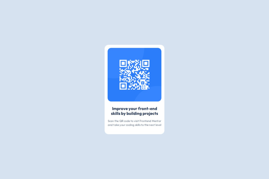
Design comparison
Solution retrospective
I am particularly proud of the responsive layout of my project. By using Flexbox and relative units, I was able to create a design that adapts seamlessly to different screen sizes. Additionally, leveraging CSS variables for managing colors and fonts made the code much cleaner and easier to maintain.
I learned the importance of good accessibility, particularly by using descriptive alt attributes for images, which enhances the experience for users with screen readers. I also deepened my understanding of font management and content fluidity with CSS properties like box-sizing and overflow-wrap.
Next time, I would focus more on improving accessibility and optimizing performance, such as reducing image sizes and avoiding the use of experimental CSS properties. I would also explore advanced techniques for text rendering to ensure an optimal user experience across all devices.
What challenges did you encounter, and how did you overcome them?One of the main challenges I faced was ensuring the responsive design worked seamlessly across various devices. Initially, certain elements were misaligned or did not scale properly, leading to an inconsistent user experience.
To overcome this, I implemented CSS Flexbox for the layout, allowing for a more adaptable arrangement of elements. I also utilized relative units like percentages and rem for sizing, which helped maintain proportions across different screen sizes. By testing the design on multiple devices, I was able to make necessary adjustments to ensure a smooth and responsive layout.
I am interested in learning more about advanced CSS techniques, specifically CSS Grid and animations. I would appreciate guidance on how to effectively integrate these techniques into my current layout to enhance the visual appeal and user experience. Any resources or examples of best practices would be greatly helpful.
Community feedback
Please log in to post a comment
Log in with GitHubJoin our Discord community
Join thousands of Frontend Mentor community members taking the challenges, sharing resources, helping each other, and chatting about all things front-end!
Join our Discord
