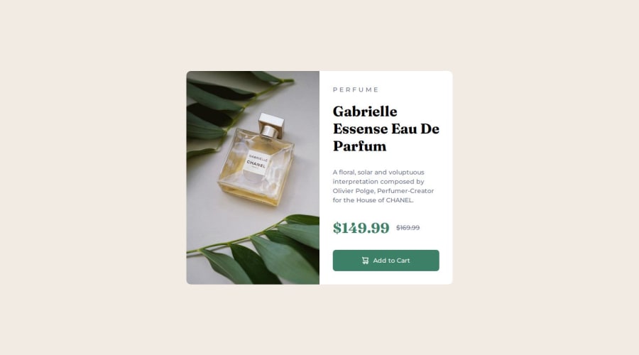
#Frontend Mentor - Product preview card component solution


Design comparison

Solution retrospective
I could complete the project without much headaches like the previous one. It was easy and I would try using react to test my understanding next time.
What challenges did you encounter, and how did you overcome them?I encounter a specificity issue when trying to style a span element. I initially gave the span a colour and tried to change the colour later in the CSS but didn't quickly understand why. I was able to fix the problem using the css !important property but I didn't want the fix. So, I had to remove the span from the group style I created and style it separately.
What specific areas of your project would you like help with?I can manage on my own, at least for now.
Community feedback
- P@danielmrz-devPosted 9 months ago
Hey there! 🙋🏽♂️
Congrats on finishing the challenge! ✅
Your project looks awesome!
Here's a tip that might interest you:
📌 When you have different versions of the same image, consider using the
<picture>tag.This will help ensure the correct image loads on the user's device, saving bandwidth and boosting performance.
Example:
<picture>
    <source media="(min-width: 768px)" srcset="{desktop image path here}">
    <img src="{mobile image path here}" alt="{alternative text here}">
</picture>
Hope you find this useful!
Great job overall!
Marked as helpful1@adewalemudasiruPosted 9 months agoThanks for your feedback. I thought of using the picture tag but I wasn't sure about the implementation. With the example code you have provided for the HTML, how do I use/call for the right image in CSS or does the browser automatically recognise the right image for the screen size and set it? @danielmrz-dev
1P@danielmrz-devPosted 9 months ago@adewalemudasiru
You don't need to call it with CSS (media queries). You just set the two versions inside picture tag and it will automatically switch depending on the screen size.
1@adewalemudasiruPosted 9 months agoI tried the picture tag element and got it working. It's really useful. Thanks @danielmrz-dev
1 - @JosmigaPosted 9 months ago
Thats a nice page my friend, well done. I do not have any advices for you.
1


Please log in to post a comment
Log in with GitHub
Join our Discord community
Join thousands of Frontend Mentor community members taking the challenges, sharing resources, helping each other, and chatting about all things front-end!
Join our Discord