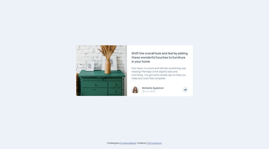
Front end mentor challenge: Article preview component
Design comparison
Solution retrospective
Please tell me if anything can be improved- especially with the javascript!
Community feedback
- @dylan-dot-cPosted 17 days ago
looking good! I saw you commented on someone's solution and they used the .toggle method which allows smooth switching of state with css
One thing I realized is that you should try and use only one popup container and try and make it work for both desktop and mobile screen sizes since you only have to write some extra css code and media queries, other than that you should be good
For semantic html, I see you use a section in a div, you could make the card a section or even an article and make the content inside a div if you want
Marked as helpful0@TheTrueScoutPosted 17 days ago@dylan-dot-c Thank you! I didn't even think of using one popup- that would've been much better. I'll keep these in mind for next time :). Thanks again!
0
Please log in to post a comment
Log in with GitHubJoin our Discord community
Join thousands of Frontend Mentor community members taking the challenges, sharing resources, helping each other, and chatting about all things front-end!
Join our Discord