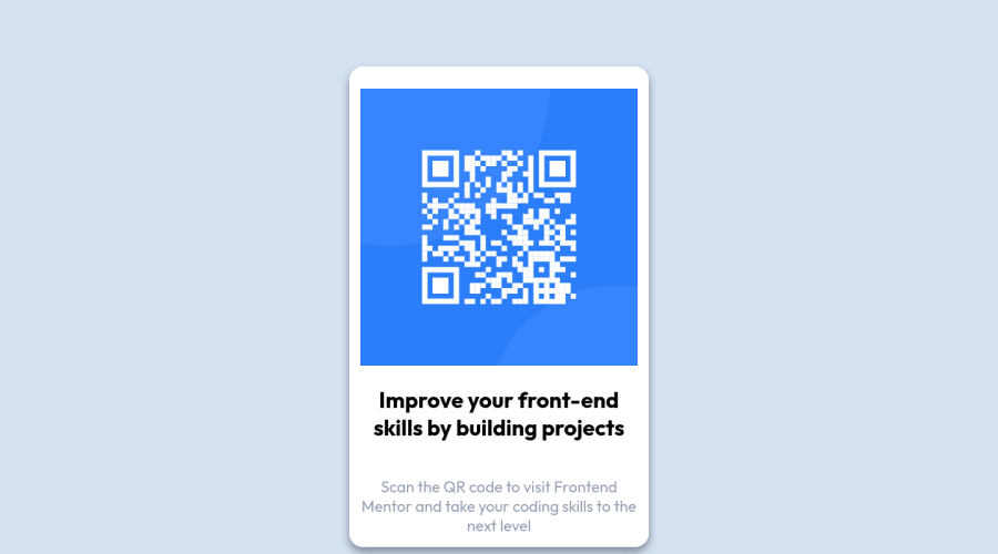
Design comparison
Solution retrospective
feel free to submit a reveiw
Community feedback
- @PhoenixDev22Posted over 2 years ago
Hello MoDuke-12,
Congratulation on completing this challenge. your solution looks great. I have some suggestions regarding your solution if you don’t mind:
-
Use the
<main>landmark to wrap the card. HTML5 landmark elements are used to improve navigation experience on your site for users of assistive technology. -
The alternate text should be present in that image as it’s an important content (informative image). And it should tells the users where it takes : like
Qr code to frontend mentor
CSS:
- To center the component on the middle of the page you may use the flex/grid properties with
min-height 100vh;to the body.(Then you can remove the margin: 6rem). Also you can add a little padding to the body to prevent the card from hitting the screen edges.
body{ /*margin: 6rem; */ align-items: center; min-height: 100vh; }-
height: 630px;It's not recommended to set height to component, let the content of the component define the height. -
Last ,the better way to style your HTML elements is using single class selector.
Aside these , Good work! Hopefully this feedback helps
1@MohammedDukePosted over 2 years ago@PhoenixDev22 I really enjoyed your comment and thank you for your time to help me Thank you
1@PhoenixDev22Posted over 2 years ago@MoDuke-12 You’re welcome and glad it was helpful .
0 -
Please log in to post a comment
Log in with GitHubJoin our Discord community
Join thousands of Frontend Mentor community members taking the challenges, sharing resources, helping each other, and chatting about all things front-end!
Join our Discord
