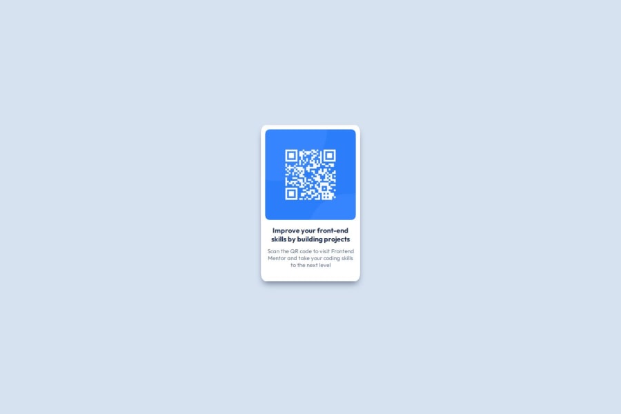
Design comparison
SolutionDesign
Community feedback
- @indigorosePosted about 2 months ago
This is really good submission on this challenge. The html is easy to read and the css is dry as well. Did you use a mobile first or desktop first responsive approach? Look forward to seeing your other challenge solutions on this site.
0
Please log in to post a comment
Log in with GitHubJoin our Discord community
Join thousands of Frontend Mentor community members taking the challenges, sharing resources, helping each other, and chatting about all things front-end!
Join our Discord
