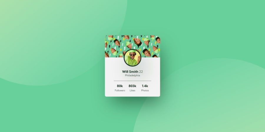
Fresh Prince Card Component (Vanilla CSS + Easter Eggs)
Design comparison
Solution retrospective
👾 Hello, Frontend Mentor coding community. This is my solution for the Profile Card Component.
Feel free to leave any feedback and help me improve my solution or make the code clean!
😁 I had a lots of fun building this challenge! I changed almost all design with the FRESH PRINCE THEME
😪 I had some issues position the circles as background so I just export the background from Figma. My bad.
I added some features:
- 🎨 Custom hover on profile image using the general sibling selector.
- 👨🔬 Custom hover effect on profile background!
I'll be happy to hear any feedback and advice!
Community feedback
- @xXkosziarzXxPosted about 2 years ago
your suggestion background-position: top right, bottom left; it works only half way below it gives a solution even the color for you body { font-family: 'Kumbh Sans', sans-serif;
background-color:hsl(152, 62%, 63%); background-position: -150% -180%, 190% 280%; background-image: url(images/bg-pattern-top.svg ),url(images/bg-pattern-bottom.svg); background-size: 80% 80%; height: 100vh; background-repeat:no-repeat no-repeat; display:flex; align-items: center; justify-content:space-around; } I don't know how to ship in an item like you youMarked as helpful0 - @xXkosziarzXxPosted about 2 years ago
hi lucas
looking for a solution on how to make a background like this, I checked your code and noticed a little cheat on your part because your image has been modified and in this task it is probably one of the most difficult tasks
Marked as helpful0@correlucasPosted about 2 years ago@xXkosziarzXx Hello Michal, Indeed I cheat in this challenge 😂, but then I discovered how to position both circles with
background-position: top right, bottom left;
. I was only lazy to update it. And indeed is the hardest part for this challenge.0@Error-at-nightPosted about 2 years ago@correlucas Hello I have been finding it add to position both circles, when I resize my browser to mobile size, but its not showing, only the card profile is showing.
Please I need some help on how I can fix that. I was thinking you had done the challenge, but I found out you actually cheated 😅😅 and you used different images
0 - @AdrianoEscarabotePosted about 2 years ago
Fala lucas! Tudo bem?
Gostei muito do resultado do seu projeto, lembro que a primeira que vi, eu pensei que você tinha usado js para fazer este efeito de hover, agora vendo que você fez tudo com css, fico um pouco assustado de ver o tanto que você manja de css, é realmente impressionante.
As imagens de fundo também foram um grande problema neste desafio, principalmente por que eu não conhecia o
background-image:;
e o position: absolute; kkkkkkkkFicou muito bom man!
Parabéns!
1
Please log in to post a comment
Log in with GitHubJoin our Discord community
Join thousands of Frontend Mentor community members taking the challenges, sharing resources, helping each other, and chatting about all things front-end!
Join our Discord