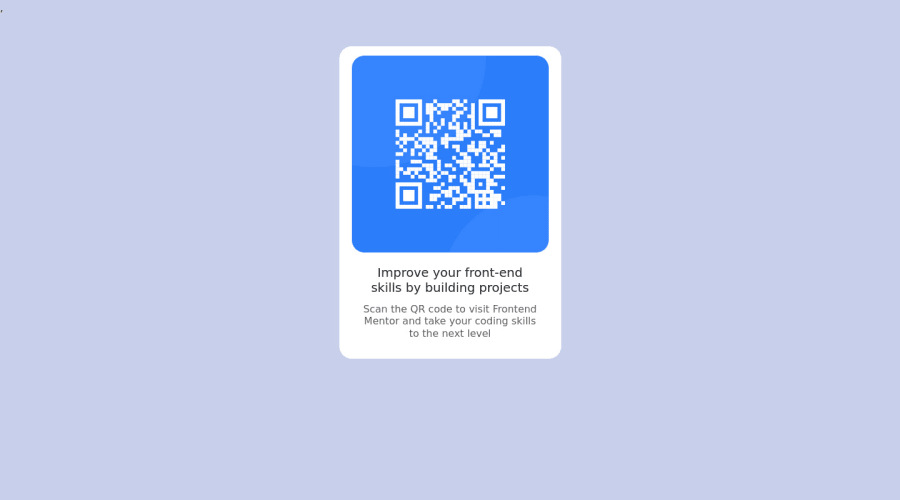
Design comparison
Solution retrospective
Como é meu primeiro desafio não tenho certeza se usei as formatações corretas. Deveria der feito diferente?
Community feedback
- @JoshuaBlick94Posted over 1 year ago
Hi, my congratulations you did such a great job on your design.
Here are some tips to make your design look better. Use semantic tags for your code for example section, main etc to help screen readers navigate your design with ease.
You can also make increase the font weight of your heading to 600 or 700 to match the design.
I hope I was useful. Keep coding
0 - @Daniel-BilodidPosted over 1 year ago
Hi, my congratulations you did a great job 🎉
𝐒𝐨𝐦𝐞 𝐭𝐢𝐩𝐬 𝐟𝐨𝐫 𝐲𝐨𝐮𝐫 𝐜𝐨𝐝𝐞 🛠
🔹 You need to put a landmark in your code
simply wrap your code with <main> landmark
📚 The <main> HTML element is intended for the main content (content) of the <body> of the document (page).
🔹 And you need to add an alt tag to your images
📚 The alt attribute contains a textual description of the image, which is optional but incredibly useful for accessibility
I hope it was helpful, you are great, keep up the good work 👍
0
Please log in to post a comment
Log in with GitHubJoin our Discord community
Join thousands of Frontend Mentor community members taking the challenges, sharing resources, helping each other, and chatting about all things front-end!
Join our Discord
