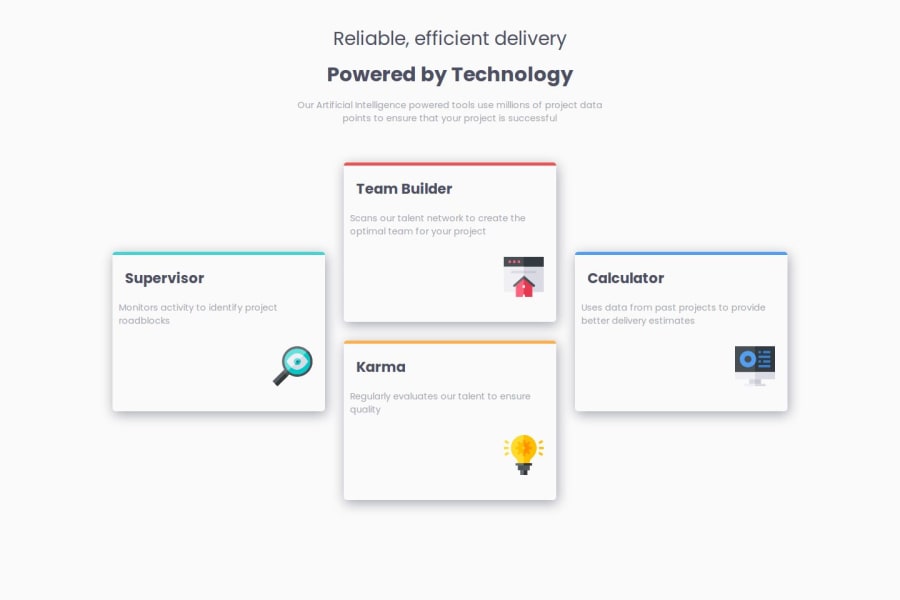
Design comparison
Solution retrospective
i tried this challenge in two different ways using grid and flexbox. i could finish it in both ways
What challenges did you encounter, and how did you overcome them?i had some challenges designing in grid. i couldnot adjust the margins between the grid as i wished. i know i had not set the gird perfectly which caused me that problem but output was accepted
What specific areas of your project would you like help with?my doubts with every challenge are the margins, paddings and the font-sizes. I try to estimate it every time from the design images but i am not sure is this the correct way or there is another.
Community feedback
- P@kodan96Posted 11 months ago
hi there! 👋
You can complete Free+ challenges, you get Figma files for them or you can subscribe to Premium, so you'll be able to download the Figma files for all challenges. Figma files makes it easy to determine overall spacing(padding, margin, etc. ).
Or you can use the PerfectPixel browser-extension, which allows you to import the design files you get for every challenge into you browser and make it semi-transparent, like an overlay.
Hope this was helpful 🙏
Good luck and happy coding! 🤘
Marked as helpful0
Please log in to post a comment
Log in with GitHubJoin our Discord community
Join thousands of Frontend Mentor community members taking the challenges, sharing resources, helping each other, and chatting about all things front-end!
Join our Discord
