Submitted almost 5 years ago
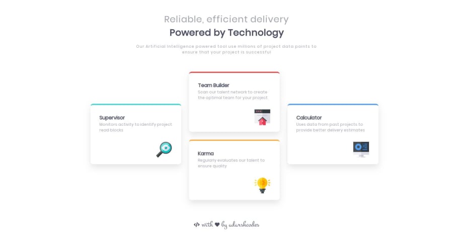
Four_Card_Section(Pure_CSS-Grid with cool Animations)
@adarshcodes
Design comparison
SolutionDesign
Community feedback
- @alex-kim-devPosted over 4 years ago
Hey Adarsh, nice solution on this challenge! I like that you added some animation for cards, cool little effects on hover. And that fancy font that you used for the attribution is looking great. I looked into the code and i have some feedback for you:
- the borders on top of the cards are slightly curved which is not in the line with the design
- for 555-768px screen sizes the cards are shifted to the right; also i think for mobile screens (375, 425px) the layout should be 1-column
- the
heightset for every card can cause issues when the content inside changes - the card icons are not pinned to the bottom of the card, if i change text ab...
- there are some css grid properties that can help with aligning the left & right cards vertically
- i think having 7 screen breakpoints is a little too much
Good luck!
1@adarshcodesPosted over 4 years ago@Alex-K1m Thank you soo much for taking a look at my solution and also for your valuable suggestions. It was a solution when I started learning front end development🙂.
0
Please log in to post a comment
Log in with GitHubJoin our Discord community
Join thousands of Frontend Mentor community members taking the challenges, sharing resources, helping each other, and chatting about all things front-end!
Join our Discord
