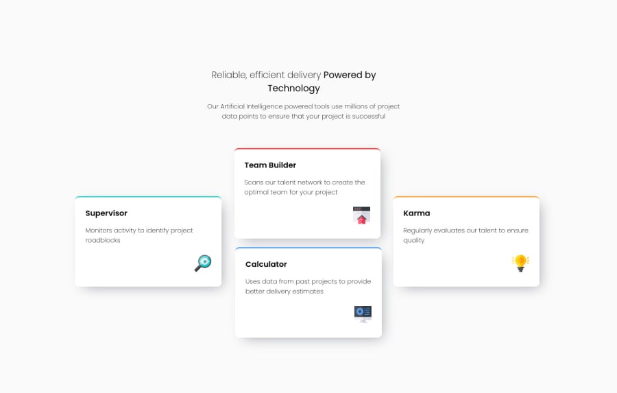
Design comparison
SolutionDesign
Community feedback
- @VCaramesPosted about 2 years ago
Hey @Azikenp, some suggestions to improve you code:
- To give you HTML code structure, you want to set up your code in the following manner (only did parent containers):
<body>
   <header></header>
   <main>
      <section>
            <div class="supervisor-card"></div>
            <div class="team-card"></div>
            <div class="karma-card"></div>
            <div class="calculator-card"></div>
      </section>
   </main>
</body>
The Header Element represents introductory content.
The Main Element identifies the main content of the document.
The Section Element can be used to wrap content that is related to each other.
And since none of the cards make sense on their own, a simple Div will do for each card.
- Using CSS Grid with Grid-Template-Areas will make things way easier when building the layout; it will give you full control of the layout.
.card-container {
    grid-template-columns: repeat(3, 1fr);
    grid-template-rows: repeat(2, 1fr);
    grid-template-areas:
      "supervisor team calculator"
      "supervisor karma calculator";
  }

  .karma-card {
    grid-area: karma;
  }

  .calculator-card {
    grid-area: calculator;
    align-self: center;
  }

  .team-card {
    grid-area: team;
  }

  .supervisor-card {
    grid-area: supervisor;
    align-self: center;
  }
Happy Coding! 👻🎃
Marked as helpful0
Please log in to post a comment
Log in with GitHubJoin our Discord community
Join thousands of Frontend Mentor community members taking the challenges, sharing resources, helping each other, and chatting about all things front-end!
Join our Discord
