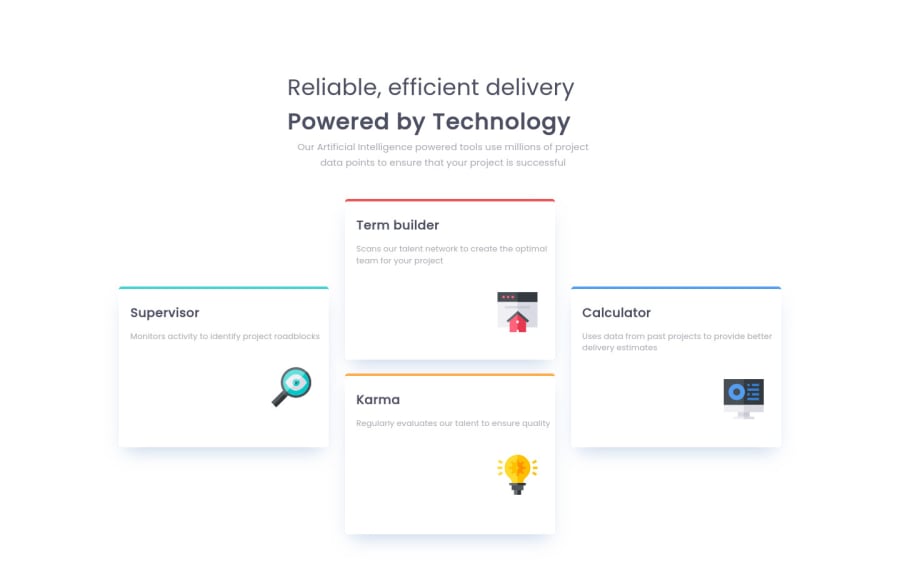
Design comparison
Solution retrospective
Responsive issue with this challenge:
- I have 3 breakpoints for the responsive A. max-width: 320px (custom code A) B. min-width: 321px and max-width: 992px (custom code B) C. min-width: 320px to max-width: 992px (code for A and B).
Is it a good approach ?
- For the card, i have used flexbox with tree div in a parent (card-content-item) A. div A: card item1 B. div B: card item2 and card item3 (flex-direction: center) C. div C: card item4
Is there a better solution?
Community feedback
- @correlucasPosted about 2 years ago
👾Hello @devwinner-sek, Congratulations on completing this challenge!
Great code and great solution! I’ve few suggestions for you that you can consider adding to your code:
1.Improve the semantic replacing the
<div>used for the four cards and use instead<article>that is a better tag, remember that<div>doesn’t have any effective meaning is just a block elements, so for big block of elements use semantic tags.This a good resource to understand more about
semantic tags:https://www.w3schools.com/html/html5_semantic_elements.asp2.Add the website favicon inserting the svg image inside the
<head>.<link rel="icon" type="image/x-icon" href="./images/favicon-32x32.png">3.The main heading has the tag
<p>, in this case, you should replace it with<h1>since this heading is the main title on this page. Remember that every page should have one<h1>to declare which is the most important title and that you should follow the hierarchy using the heading sequence(h1, h2, h3, h4, h5)and never jump a level.✌️ I hope this helps you and happy coding!
0
Please log in to post a comment
Log in with GitHubJoin our Discord community
Join thousands of Frontend Mentor community members taking the challenges, sharing resources, helping each other, and chatting about all things front-end!
Join our Discord
