Submitted almost 2 years ago
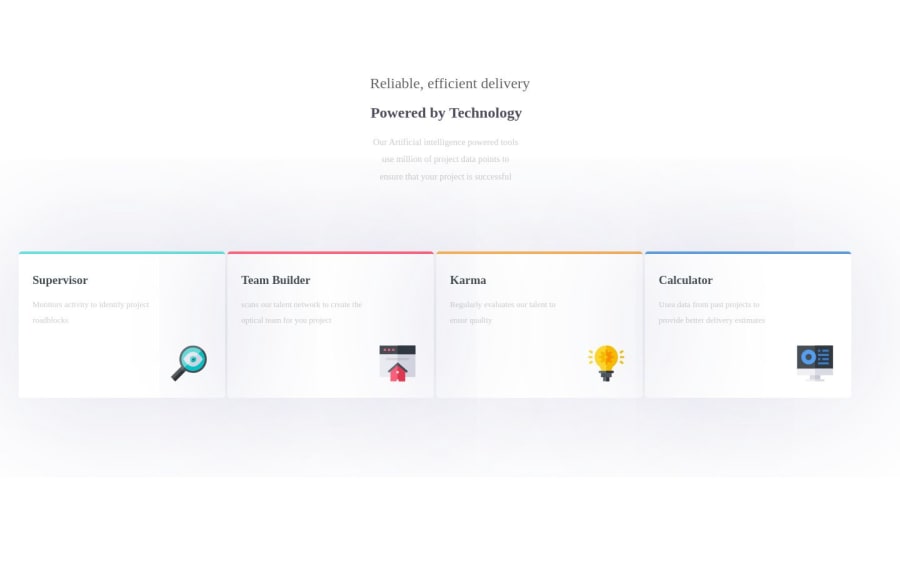
four-card-feature-section-master using html&css
#accessibility#astro#backbone#bootstrap#cube-css
@modyrag
Design comparison
SolutionDesign
Community feedback
- @AnggaWibawaPosted 6 months ago
The result is good enough, such as the logo that fits in the lower right corner of the card and the placement of the header, but you can still improve it, I have some suggestions, namely:
- Adjust the font according to the example given, and also place the card as in the example, you can try it with CSS Grid.
- If the project requires writing a lot of CSS, you can create it in a new CSS file, then connect it to your HTML.
- If an element is required to have a distance from each other, you should not type a lot of < br />, it is better to use margin, padding, and many more CSS functions to set the distance.
Maybe this is all I can suggest, hopefully this advice can help, and keep learning!!!
0
Please log in to post a comment
Log in with GitHubJoin our Discord community
Join thousands of Frontend Mentor community members taking the challenges, sharing resources, helping each other, and chatting about all things front-end!
Join our Discord
