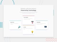
Design comparison
SolutionDesign
Community feedback
- @notabhishekraiPosted over 2 years ago
pretty impressive. Few suggestions:
- use max-width on the container so that your cards don't stretch in bigger screens.
- "Reliable, efficient delivery" and Powered by Technology are two different headings. I see you have used span tag inside the h1, in my screen (1920px) they come in the same line so use h1 and h2 in respective order.
other than that, pretty good. 1 like for hard work
0
Please log in to post a comment
Log in with GitHubJoin our Discord community
Join thousands of Frontend Mentor community members taking the challenges, sharing resources, helping each other, and chatting about all things front-end!
Join our Discord

