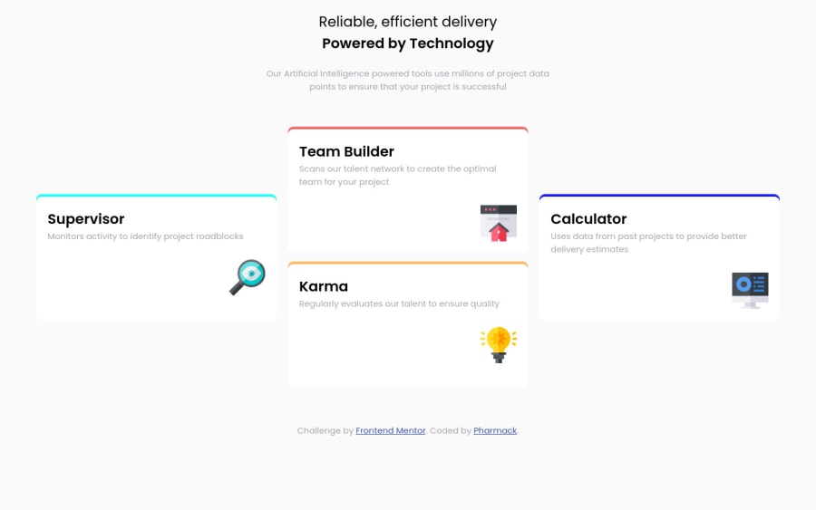
Design comparison
Solution retrospective
Your comment is welcome
Community feedback
- @kyrylolvovPosted over 4 years ago
Hey! 😀
Great job on this challenge! 🏆
What I would recommend, is editing the min-width media query, as there are devices that have 320px in width, while your website is adaptive only until 375px 🙂
1@grace-snowPosted over 4 years agoI was about to say the same thing ☺
I am. On mobile but seeing the desktop version all squished
If you're using min width media queries and working up to larger screens you don't need to put the mobile styles in a media query at all. They can form your base styles, then only change what you need in media queries as the viewport increases.
Good luck 👍
0
Please log in to post a comment
Log in with GitHubJoin our Discord community
Join thousands of Frontend Mentor community members taking the challenges, sharing resources, helping each other, and chatting about all things front-end!
Join our Discord
