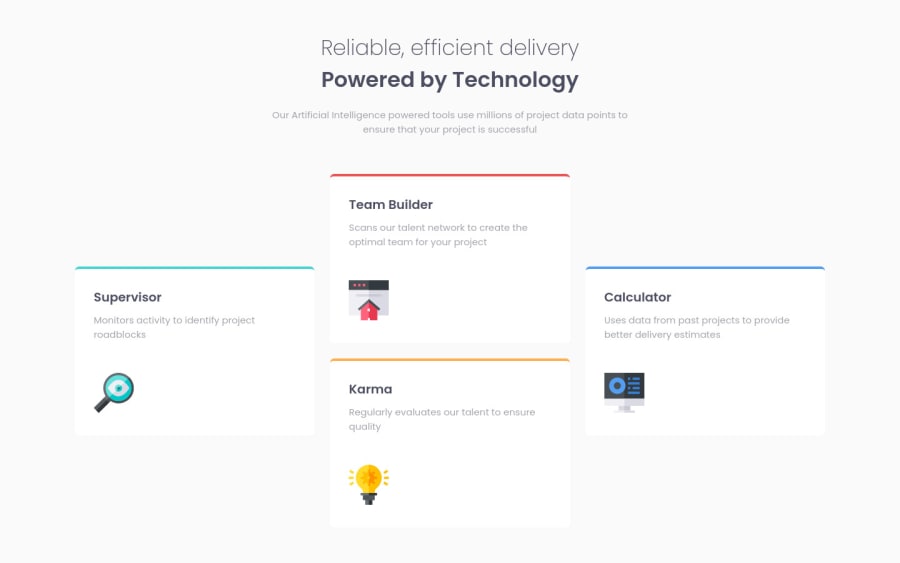
four-card-feature-section structured with grid and order with flex
Design comparison
Solution retrospective
Feedback is welcome!
Community feedback
- @isprutfromuaPosted over 2 years ago
Hi there. You did a good job 😎
keep improving your programming skills🛠️
your solution looks great, however, if you want to improve it, you can follow these steps:
✅ place the Google import code such that it loads first directly after the html HEAD tag, EVEN before loading the CSS file. This ensures the fonts load before the CSS so there isn't any unexpected "jumping" of when the font finally loads.
✅ instead of duplicating classes here
.card1
{
    border-top: 4px solid var(--cyan);
}
.card2
{
    border-top: 4px solid var(--red);
}
.card3
{
    border-top: 4px solid var(--orange);
}
.card4
{
    border-top: 4px solid var(--blue);
}
you could do that
.card--bordered {
	border-top-width: 4px;
	border-top-style: solid;
}

.cyan-border
{
    border-top-clor: var(--cyan);
}

.red-border
{
    border-top-clor: var(--red);
}

.orange-border
{
    border-top-clor: var(--orange);
}

.blue-border
{
    border-top-clor: var(--blue);
}
✅ don't use tag selectors. When you add CSS directly on tags, your markup can’t change. Your style is tightly coupled to your DOM, and any change increases the risk of breaking things.
✅ You Should Stop Using Pixels. They are static and aren’t truly relative to the root font-size like REM and EM units
.header p
{
    max-width: 600px;
    margin: 0 auto;
    margin-top: 20px;

}

.main
{
    display: grid;
    grid-template-columns: 1fr 1fr 1fr;
    gap: 25px;
    margin-top: 60px;
}

.card
{
    background-color: #fff;
    border-radius: 7px;
    padding: 30px;
}
Good luck and fun coding 🤝⌨️
Marked as helpful1
Please log in to post a comment
Log in with GitHubJoin our Discord community
Join thousands of Frontend Mentor community members taking the challenges, sharing resources, helping each other, and chatting about all things front-end!
Join our Discord
